Tone - Straight Images
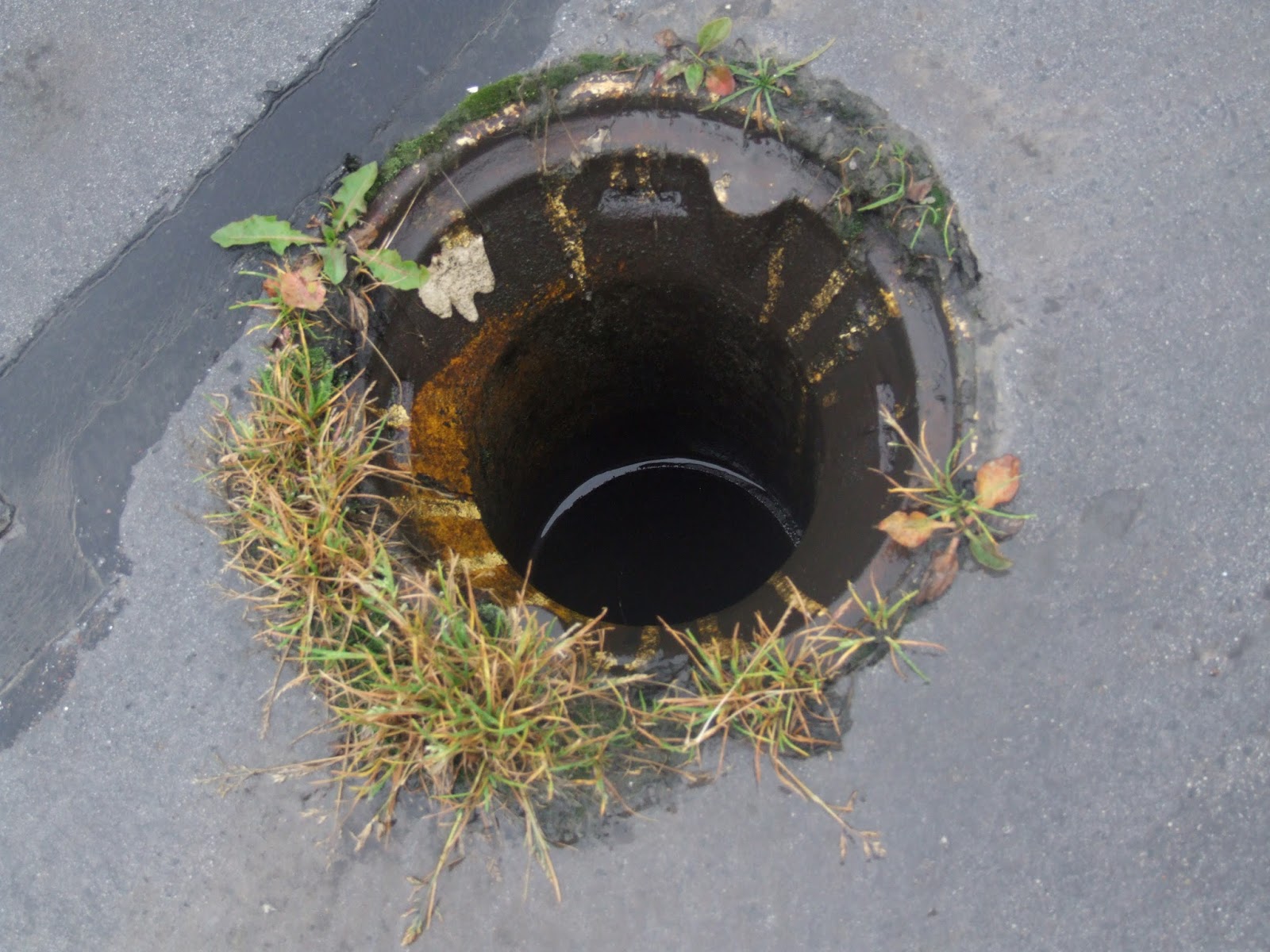
I really like this image as I think it shows depth due to the hole which is in the centre of the image. However, I think it would look more effective in black and white so the formal element of tone was more obvious in the image.

I then edited the image in photoshop and found that it looked better in black and white. I think the image looks more eye-catching in black and white and also presents the formal element of tome better.

This is one of my favourite images as I think it shows tone very well. I have this image in my work diary and have edited it to black and white. I think it looks better in black and white as it allows the shades to contrast more and therefore makes the image more appealing and striking.

I really like this image as it shows tone very well without any editing. I think the image is interesting due to the shape that is shown in the shoe print and also with the pattern in the shoe. I also like the image as you are able to see the detail in the tarmac and this makes the image more interesting.

I really like this image as it shows tone well without the image having to be edited. I also like how it is the water droplets which lead to the change in tones in the photo. This makes the image appear more detailed and interesting.

I took this image in the studio and had one side of the object lit and had the other side in shadow. I really like how my image turned out and like how the object is illuminated and the background is very dark. This makes the flowers the focus point of the image and makes the image eye-catching. I also photographed a doll in the studio. The images for this are included on my contact sheet.
No comments:
Post a Comment