Showing posts with label Technical Exercises. Show all posts

Thursday, 10 December 2015

Photoshop - Retouching

Editing - Retouching

In today's lesson, we used photoshop to retouch portraits. I retouched an image which I captured during my studio portrait shoot. I really liked this image as an original but think that it looks even more effective in the new edited version. Below shows a screenshot of my photoshop page during the editing process.


Firstly, we edited the basic flaws of the image. To do this I followed the below method -

1. Open the image and select Image, mode and then CMYK colour. 
2. When this has opened, go to channels and select yellow.
3. Press cmdA and then cmdC.
4. Then, go back to layers and press cmd alt Z and then cmdV.
5. Then rename the yellow layer 'Flaws' and press cmdV to invert.
6. Following this step, change 'normal' to 'soft light' and set the opacity to 50%.
7. Then, select the colour white and select the paintbrush tool and paint the desired areas of the image.

Then, we followed the previous method by altering any blemishes on the subject. To do this, we -

1. Press cmdJ to copy the background and rename the new layer 'Blemishes'.
2. Then select either the healing brush or spot healing brush which is on the menu on the left hand side of the screen.
3. Then select an area of clear skin and then paint over the spots or blemishes on which are in the image. 


Above is my original image.

Above is my edited image. I think that these edits are helpful when editing and photographing for the topic of portraiture as it helps to make adjustments and also allows imperfections to be fixed. In my opinion, the ability to edit out things like blemishes is helpful as it helps in the portrayal of the subject and gives a clear representation of what the individual is usually like and their appearance is therefore not altered by things which are not permanent and not usually there like spots and blemishes. In addition, I think that the image is more eye-catching and looks better due to the fact that the subjects skin appears to be clearer and the overall image is lighter than the original which I think looks effective. I also think that the edits help to make the image appear more professional and striking to the audience's eye. 

Tuesday, 8 December 2015

Lighting for Portraiture in the Studio

Low Key Lighting for Portraiture

1. Place the snoot over the mono-block light
2. Use the light reader to determine the correct camera settings.
3. For our shoot, I set the camera to ISO 200, f/stop 16 and the shutter speed of 1/125.

During the session on low key lighting, I experimented with taking portraits using this type of lighting and the above camera settings. Below shows some of my outcomes from the session. I really like how the images suggest an element of mystery due to the fact that they are quite dark and therefore appear to be quite dramatic.

I then edited my original images which are shown below to give them a black and white filter. In my opinion, the edited versions look much more effective as the edits help to show the highlighted areas as well as the shadowed areas. I also edited the image by increasing the saturation and also altering the curves to make the overall image brighter to therefore help the subject appear more striking and attract the audiences eye more. I also prefer the edits as I believe that the black and white filter helps to portray the element of mystery that is presented in the portraits which are captured with the low key lighting. Overall, I really like the outcome from the session and feel as though the lighting has helped to create a more dramatic photograph.

Although I like the original image and its composition, I feel that the image was more successful when it had been edited using photoshop.

With the above images, I really like the way that the light has been manipulated in order to make the main light be on the subjects face. This therefore helps to draw the audiences eye to this area as the main focus point of the image. I like the edit as I think that it has been successful in brightening the illuminated area of the image. 

I really like the composition of this image and like the element of shadow which is present within the image.

I especially like the edited version and feel it is a more successful image than the original. I like the way that the element of shadow is still present and like how, using the edit, I have managed to brighten the image and also by doing this, give certain areas of the image, such as the hair and the hand, more definition.

I like this image and like the alternative way of the photograph being taken as a landscape shot. I think that in this image, this is effective as it has allowed more negative space to be created either side of the subject's face. 

I really like this edit which was done using photoshop. I like how I have managed to enlighten the skin tones as this does not only draw more attention to the face, but also makes the shadows more apparent on the face. I think that these shadows look very effective and add interest to the image. I achieved the position of the shadows by manipulating the positioning of the low key lighting in the studio. 

Low Key Lighting - Contact Sheet

Low Key Lighting - Contact Sheet


Monday, 7 December 2015

Lighting Techniques for Portraiture (studio)

Lighting Techniques for Portraiture

The choice of lighting will influence the viewers perception of the subjects mood in a portrait. 

High Key Lighting - Uses predominantly light tones. It is often used to portray upbeat moods. 

Low Key Lighting - This set up usually consists of a three-point lighting set up. Predominantly uses darker tones.

Snoot - A snoot is a tube or similar object that fits over a studio light of a portable flash which allows the photographer to control the direction and radius of the light beam. Snoots can isolate a subject when using a flash. The snoot directs the light.


Reflector Dish - Reflects the light in order to create a more concentrated beam. 


Honeycomb - The honeycomb grid is a tight structure and is usually found affixed to the front of a studio strobe or can be alternatively fixed to an off camera flash. The light shines through the grid and creates a beam of light with the aim of creating a focused beam with little diffusion. It restricts the light path. 


Irving Penn is an American photographer who is known for his fashion photography, portraits and still life shots. Penn's career included work at the Vogue magazine as well as independent advertising work for clients including Issey Miyake and Clinique. Below shows a selection of his work:


Tuesday, 24 November 2015

Portraiture (studio) - Straight Images - Best 5

Portraiture - Straight Images - Best 5

The three images below were inspired by Thomas Ruff's work. He uses colourful backgrounds and also uses only head and shoulder shots to create his portraits. I really like the three images below as they show a variety of different emotions portrayed by the same subject. 

I like this image as I feel it suggests that the subject is surprised. I like the way that the subject is positioned to one side of the frame as it creates effect and makes the image more interesting and attractive. I edited my image in photoshop and adjusted the curves and also sharpened the image.


I like this image as it looks as thought the subject is deep in thought. Again, I like the way that the subject is positioned towards the right hand side of the frame and also like the way that they are not looking directly at the camera. I edited my image in photoshop by adjusting the curves to make the image brighter and also increased the sharpness of the image.

I also like this image as I think that the subject appears to be stressed. Although in real life it is likely that the subject didn't feel this way, the image shows a strong connection with this emotion due to the fact that the person is looking up and also has their hands raised towards their head. 


The two images below were taken in the style of Richard Avedon. I think the way that he captures and edits images is effective and think that the usual black and white filter he applies makes the images more attractive and eye-catching. 

I like this image as it uses a prop to add more interest to the image. I like the black and white theme which is present in the image due to the subject wearing black clothes and the background being white. 

To make my images more like the images by Richard Avedon, I added a black and white filter to my image and also altered the curves. I like the outcome as I feel that the photograph now looks more in the style of the artist I was trying to capture the style of. 

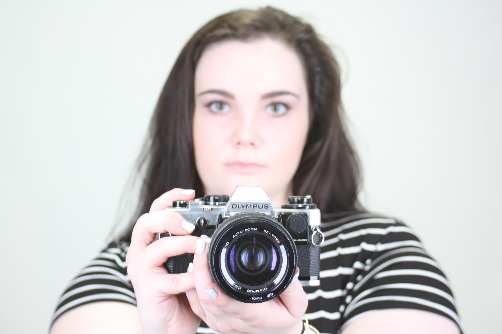
I also like this image as it relies on more interpretation due to the fact that the subject's face is covered by the camera. Again, I like the addition of the prop as it helps to add interest to the image and therefore helps to attract the audience's eye more. 

Again, here I added a black and white filter and adapted the curves of the image and really like the outcome as I feel that it now portrays the style of Richard Avedon more accurately.

Portraiture (studio) - Contact Sheet

Portraiture - Contact Sheet


Wednesday, 11 November 2015

Depth - Work Diary

Depth - Work Diary

Evaluation

In Tuesday's session, we were given the task of shooting for the topic of depth. To do this, we had to use the cameras on manual mode and manipulated the f/stop values on the cameras whilst we were out shooting to ensure our images turned out the way we wanted them to be. Initially, I found using the camera on manual mode quite challenging, but after a while, got the hang of it and actually found manual mode to be better than auto focus mode. During the shoot, I found myself photographing a lot of natural things as I found that these created the best images to portray depth. Overall, I found that shooting for depth was enjoyable and that it allowed me to be creative. Also, having the camera on manual mode, allowed me to focus on specific areas of the shots. I also took some photographs in the studio using people. I really like the outcome as I feel that the images present a different form of depth. In addition to the work in the studio, we also explored the presence of depth by means of structures such as sculptures. I did not really like these images as I thought they were quite boring and were not eye-catching at all. Below shows some examples of the images that I captured during the session.

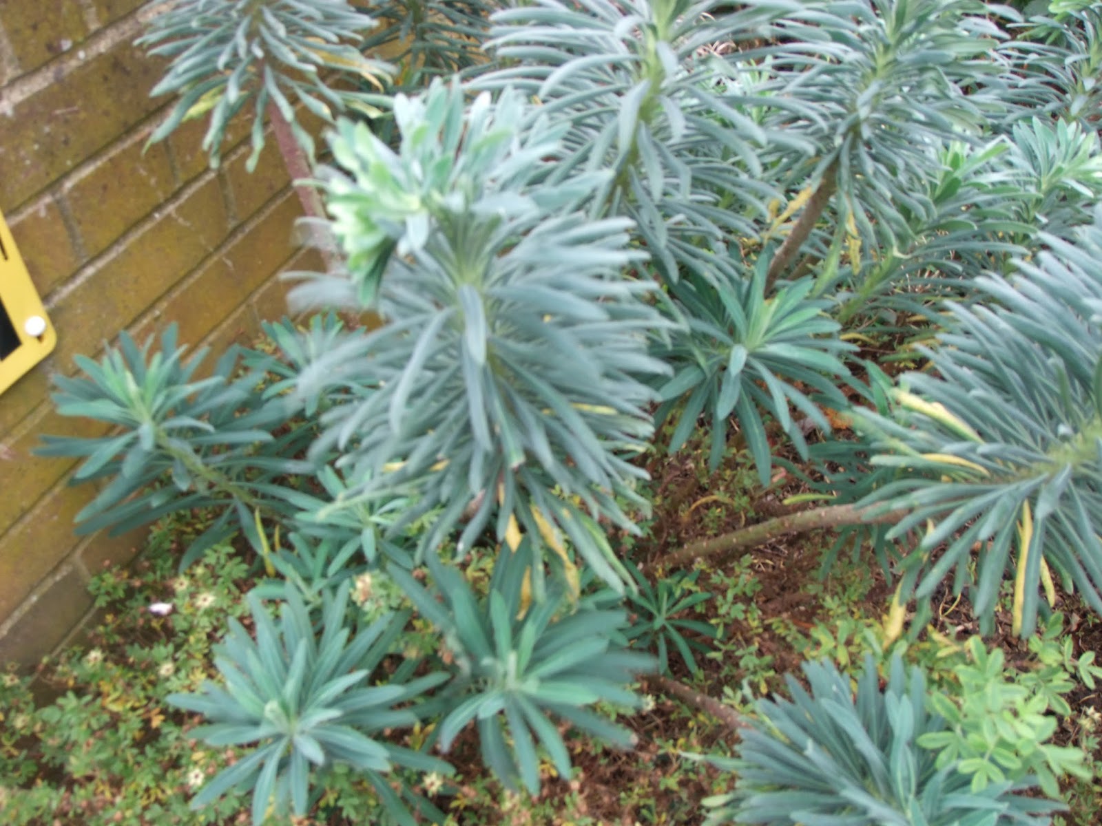
This is one of my favourite images as it shows depth very well. It shows narrow depth of field and I also like the way that it shows an example of point of focus. In my opinion, the image is quite interesting due to the shapes which are present in the image as well as the quite striking colours.

This is another of my favourite images and also shows a narrow depth of field. I really like this image as it would normally be considered to be boring, but with the added element of depth, the image has become more interesting. I really like how you are able to see the detail which is on the wire as this makes the image more eye-catching and interesting to the audience. 

This is my favourite image that I captured in the studio. For this image, I used the f/stop value of 5.6 in order to achieve the narrow depth of field which is present in the image. 

This image is my least favourite from my shoot. I took this image relatively early on in the shoot when I was struggling with using the camera on manual mode. This image does not show depth and does not demonstrate either a narrow or wide depth of field. For this reason, I do not feel that this is a successful image.


Idea Development

If I were to shoot for the topic of depth again, I would continue shooting my preferred natural forms of depth. I think that this would help to create more interesting and quality images as I think that the colours which are shown in these forms are extremely striking and help to make the overall image more attractive and capture the audiences attention. I would also like to look more specifically into photographing leaves as I think that the colours and patterns that they show would make for an eye-catching and quality image. This would also be a good way to shoot for a close up example of depth. Below shows some images which I would use for inspiration if I had to go out and shoot for the topic of depth again.


Tuesday, 10 November 2015

Depth - Straight Images - Best 5

Depth - Straight Images - Best 5


I really like this image as I feel it has captured depth well. I like how the leaves in the foreground are in good focus whilst the tiles on the ground and the other leaves are out of focus. This image demonstrates a narrow depth of field as only one area is in focus. I captured this image with the f/stop value of 5.6.

I really like this image and especially like the colours as I feel they add interest to the image. The main focus point in the image is the leaves in the centre and towards the left hand side. The image is effective as the use of a narrow depth of field helps to draw the audience's eye to the area of the image which is in good focus. The leaves in which the eyes are drawn to are also especially effective as they are quite light in colour in comparison to the background which is not in focus. I used f/5.6 for this image.

I edited the image on photoshop and increased the contest. I really like the outcome and feel that it makes the plant stand out more and therefore allows the image to present the theme of depth more clearly.

I like this image as it demonstrates a different type of depth of field in the form of it being wide. This allows all of the image to be in focus. Although with this type of depth of field you are able to see more detail in the image as it is all in focus, it does not show the element of depth so effectively and as an image, appears to be more two dimensional. I used f/11 when capturing this image.


I really like this image where there is again, a narrow depth of field used. I especially like how only the area in the middle is in focus as this contributes to the portrayal of depth in the image. This image was somewhat inspired by the photo of the wire in my image bank, as that also was an example of an image showing point of focus. I used f/3 for this image.

I edited the image and put a black and white filter on it. I think that this looks effective. However, I prefer the colour version of the image as I feel that the original is more successful with the presentation of the theme of depth. 

I really like this image as it shows both pattern as well as depth. I like how a generally boring photograph has been made more interesting through the use of depth. I also like how you are able to see a lot of detail on the wires, such as the light falling on it as well as a small insect on the left hand side of the image. The image shows a narrow depth of field due to the fact that only one part is in focus. I used f/5.6 for this image.

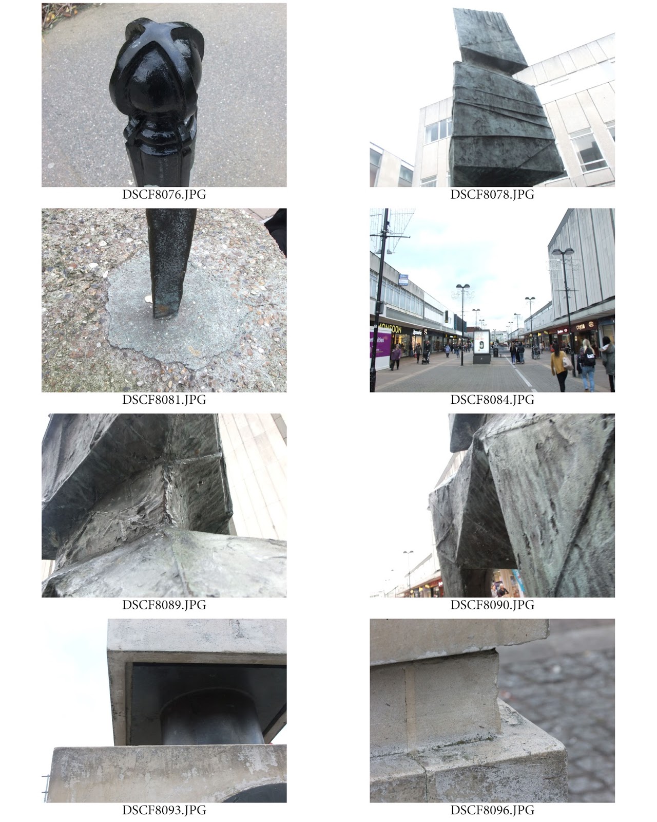
Depth - Sculptures - Contact Sheet

Depth - Sculptures - Contact Sheet

We also took photographs of sculptures to present the topic of depth.