Showing posts with label Image Bank. Show all posts

Tuesday, 24 November 2015

Portraiture - Image Bank

Portraiture - Image Bank


I really like this image as the idea of the half face which is shown by the misted up window. I also like the added element of the water droplets as they add more interest to the image. I also like how the child that is being photographed appears very natural and looks to be curious according to their facial expressions. 

I really like this image as the colours are very warm so make the image seem appealing and attractive to the eye. I like how the child in the image, again seems natural and I also like how they are positioned to  one side of the image rather than them being completely central.

I really like the expression shown in this image as it is original and interesting. I like how the image has a black and white filter on it as this helps with presenting the tones and shades within the image, 

I like the originality of this image and think that what appears to be coloured glitter, helps to add colour to the photograph. It also helps to make the image more interesting and the addition of the colour to the image helps to draw the viewers eye to the portrait.

This image was taken by photographer Thomas Ruff. I really like how the image includes a colourful background as this attracts the viewers eye to the image and makes the portrait stand out more. In addition to this, the coloured background makes the image have a pop-art feel to it which therefore helps to make the image more attractive and striking.

I really like this image which was captured by Richard Avedon. I like the fact that the image is a half body shot as this, in some cases, can add interest and effect to the portrait as it gives the audience more to look at. In the case of this image, the fact that the portrait is a half body shot helps the audience to assess the individual in the image and by showing more of the subject, helps the audience to create an understanding about the sort of person that is being depicted.

Tuesday, 17 November 2015

Joiners - Image Bank

Joiners - Image Bank

I really like this example of a joiner as it is different to some of the others I have seen due to the spaces between some of the images. This helps to make the image more effective and eye-catching. I also like the colour theme in the image as the theme of black and white makes the image bolder and more striking. This image is by David Hockney. 


This joiner seems to be more complex due to the large amount of images that are included in the composition. I really like the idea of this increased amount of images and think that this helps to add effect to the overall photograph.


This image is also very effective as it makes the image more obviously distorted by having uneven spaces around the images. I also like the obvious overlapping effect which is present in the image as it adds effect and depth to the image. 


I really like this image and think that it looks very effective. From a distance, it appears to be a full image but when you look closer, you can see that the image is made up of multiple pictures. I like the way that in this image, the photographs are only at slight angles as I think this more uniform effect helps to make the image more effective. 

This is an example of a portrait joiner. I really like this joiner as I feel that the different angles that the photos are taken makes the overall composition interesting and therefore helps to draw the audiences eye more to the image. 


I really like this example of a portrait joiner by David Hockney who was the artist that introduced the idea of joiners. I really like the distorted element of the image and like the way that the photographs are taken from different angles as I think that this adds more interest to the image and also helps to make it more striking. 

Tuesday, 10 November 2015

Depth - Image Bank

Depth - Image Bank

This image uses a wide depth of field and this makes the image effective as it allows the viewer to focus on more of the image. I also like the colours which are in the image and like how there is focus to the centre of the image. It is likely that the image was shot with the f/stop value of around f/18.

This image uses wide depth of field. I like this photo because it is in good focus and also like how the light is shining through the trees. This gives an added interest to the image and also the colours make the photograph more eye-catching. I also like how the image shows perspective. It is likely that this image was shot with the f/stop value of around f/22.


This image uses narrow depth of field. I like how this makes only the closest area of the wire stand out. This makes this the main focus point of the image and draws your eye to this area. I also like how the rest of the image is not in focus as this also helps to draw the eye to the focused area of the wire. This image also shows an example of point of focus. It is likely that this image was shot with the f/stop of around f/2.8.


This image also uses narrow depth of field. I like the way that this narrow depth of field only focuses on the mushrooms. This helps to create focus for the centre of the image and also helps focus the eye onto the main focus point of the image. It is likely that this image was captured with the f/stop value being around f/4.

This image uses wide angle to create an image with an altered perspective. I really like how the image is quite symmetrical and like the way that the white colouring of the snow has created shadows and reflections of light within the image. It is likely that this image was shot with the f/stop of around f/22.


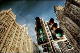
I like this image as it shows an altered perspective by using a wide angle. I like the way that this image has altered the lines of the buildings by curving them slightly. I also like how the traffic lights in the centre of the image adds interest and then draws attention to the centre of the image. It is likely that this image was shot with the f/stop value of around f/22.

Thursday, 5 November 2015

Movement - Image Bank

Movement - Image Bank

I really like how this image portrays the motion of spinning and like the way that the blur of the photo shows that a spinning motion was going on. I also like the colours in the image as I feel that they make the areas of blur more obvious which therefore helps to draw your eye to the areas where motion is being portrayed.

I think this image shows motion very well and I like how there are many blurred figures in the photograph but only the first is in focus. I also like the element of the dark background as I think this helps to attract the viewer to the element of motion as it makes the figure very eye-catching.

I really like this image as I think that it portrays motion and speed. I really like how the background and the horse's legs are blurred as this creates the feeling of fast movement. I also like how some of the horse is in focus as this allows the viewer to be drawn to this as the main focus point in the image. The image was captured by photographer Christopher Martin, who looks at images of motion and the blurring of images.

This photo was captured by photographer Ian Egner. He focuses on light trails which are created by long exposure photography. This shows motion in a more unconventional form but in my opinion, the image above is very successful in creating the theme of movement and is a very interesting image.

This image is also by Ian Egner. I really like the image as it is very interesting and appealing to the eye. It presents movement by the lines of light which are created in the road. The image is also very appealing as the colours are very striking and bold.

This image was taken  by JJ. Lartigue. It is a different sort of image than the ones which look at motion expressed by blurring. However, I think that the image clearly shows the motion of the wave which is made especially obvious with the black and white filter which has been added.

Tuesday, 20 October 2015

Reflection - Image Bank

Reflection - Image Bank

I really like this image due to the shape of the object that the images are reflected in. This makes the image very interesting as it allows the distortion of the reflection which therefore gives the image an abstract feel. I also think that the colours in the image allow it to be very bold and striking.

I think that this image is extremely effective due to the interesting subjects that are being photographed. I really like the boldness of the reflections as they are very eye-catching and therefore draw in the viewers eye. I also think that the bright white of the swans stands out well against the dull background which therefore allows them to appear bold and striking. 

I really like this image due to the strange perspective created. I especially like how you can see the umbrella which gives a reflection as it allows the viewer to get a sense of depth. I like how the figure and the sky are also part of the image as it allows the theme of reflection to be clearer.

I really like the colours in this image as I feel they assist the accurate reflection to be formed. I really like how the clouds are reflected as it gives a realistic feel to the reflection. Also I think that the bright area in the sky helps to add definition to the bike silhouettes as well as their reflection.

I really like this image and would like to try and recreate it during my shoot. I especially like the angle from which the image is taken as it gives a sense of scale and therefore portrays the idea of power with the image. Again, I really like the colouring of the image as it helps the viewer to stay focuses on the element of reflection, rather than being distracted by colour.

This image was taken by photographer Francesca Woodman. With this image, I feel that she touches on the idea of surrealism which I think is an important aspect of the element of reflection. During my shoot, I would like to try to recreate an image similar to this and for this reason, I feel that Woodman's work is very inspirational.

Tuesday, 13 October 2015

Shape - Image Bank

Shape - Image Bank

I really like this image as it is taken from an original viewing angle which therefore makes the image more interesting. I also think that the colouring of the image contributes to the eye catching representation of shape as it draws the viewers eye to the image. I also like how the negative space is the frog's silhouette as it draws the viewers eye to the main focus point in the image.

I really like this image as I think the shapes of the flowers are very interesting and catch the viewers eye. I also really like how the colours of the flowers are very bright and bold. This therefore draws your eye to the main shapes which are presented in the image. I also like how the background is blurred as again, this makes the shapes stand out more.

I like how the main shape in this image is created by irregular shapes with the hands. I also like how the shape is against the bright blue background as this makes the image more bold and striking. In someways, the shape presented could be thought of as both irregular and geometric due to the fact that the shape that has been made by the irregular shapes of the human hands but is also presenting a rather geometric star shape. 

I really like this image as I think it presents a geometric and man made example of shape. I also really like how this image is in black and white as it allows the viewer to focus more on the element of shape rather than being distracted with the other formal element of colour. I also really like how there are lots of different shapes presented in the image, for example, triangles and diamond shapes, as well as many more.

I really like this image which was photographed by Kim Hopf.  I think the angle from which it is photographed adds an element of interest to the image which therefore causes the viewers eye to be drawn into the image. I also like the vibrancy of colours in the image as I feel this makes the red building, which appears more pyramid shaped in the image, very eye catching and striking. However, I also feel that this image would look effective in black and white as it would allow the viewer to see more detail and also would make the lines sharper and therefore it is possible it would make the image more effective and bold.

I really like this image and feel it shows shape very well but in an original form. The shape is very clear and looks very effective due to the fact that it is in the centre of the frame. This image has inspired me and I will try to capture a similar type of shot when I shoot for the topic of shape.

Tuesday, 6 October 2015

Tone Image Bank

Tone Image Bank

I really like this image as it shows the light reflecting on the objects so therefore presents tone well. I also really like the range of shades which are in the image. This image looks especially effective due to the fact that it is in black and white as it focuses the viewer on the formal element of tone.

I really like this image as it is very interesting and looks very effective in black and white. It also presents tone well as you can clearly see that the fox is the main focus point in the image. It also looks effective as it looks as if the photograph is taken at night due to the shades of black and white in the image.

I really like this image as it shows a more man made example of where tone is used. I really like the contrast of the bright white and darker shades as it creates interest in the image. I also like how the image is somewhat symmetrical as it makes the image more appealing and eye catching.

This image was taken by Ansel Adams who is a photographer who focuses on tone in natural landscapes. I really like this image as the use of light makes the image look dramatic and therefore eye-catching. I really like though how there is a highlighted area in the image as it creates a focus point for the image and therefore makes it an attractive photograph. 

I feel that this image portrays tone very well but in an interesting form. The tones in the image are shown within the faces. The tones are made more obvious by the black and white filter and the very dark background. This image has inspired me to attempt some portrait like shots during my shoots for tone as I feel this image shows tone very well.

This image appears to be taken in the same style as the image above which is taken by Ansel Adams. I really like this image because it is dramatic and eye-catching. I also like how the clouds and sky are tonal as it gives the image an interesting feel.

Tuesday, 29 September 2015

Form Image Bank

Form Image Bank


This image was taken by photographer Imogen Cunningham who focuses on the illusion of form in 2D images. She photographs in black and white which adds to the depth and tone in the image which contribute to the formal element of form. I really like how this image shows a natural example of form as it adds interest to the image.

I really like this image as it presents form very well. I really like how it shows both natural and manmade examples of form. I also really like the element of perspective as the chain links get smaller towards the bottom of the image. I think the fact that the image is in black and white, helps the viewer to focus on form rather than any other aspects of the image.

I think that the bold and striking colours in this image present form really well. I also like the use of light and shade as it draws the eye to the shell which is the main focus point in the photo. I think this image would also look very effective in black and white as it would make the theme of form even clearer. I also think the stripes on the shell would look very effective in black and white.

I really like how this image presents form in a very simple way. The chess pieces almost seem to be silhouettes which I think shows the theme of form very well as although they do not appear three-dimensional, the viewer knows that they are. I also like the element of reflection which is presented in the image by the seemingly artificial lights being reflected on the table.

This is one of my favourite images as it presents two types of form. The most obvious is in the form of the shell which catches your eye as it is the darker area of the image and is easily recognisable as being 3D. The other example of form in the image is the wood that the shell is resting on. Overall, I think that this image portrays the formal element of form very well.

This image is successful in the presentation of form as it shows a very interesting example of form. The use of the black and white filter helps with this presentation as it makes the main example of form in the image more obvious and eye-catching.

Thursday, 24 September 2015

Pattern Image Bank

Pattern Image Bank

I really like this image as it shows pattern very well by taking up the entire frame. I also really like how the green is between the tiles as it makes the image more appealing and attracts the eye to the centre of the image.

I really like this image as it shows a circular type of pattern. I also like this image as it shows a natural form of pattern. The colour makes the image very appealing and therefore draws the viewers eye to the photograph. However, the trouble with the vibrant colours is the fact that viewers eyes may be more attracted by the colour than the actual pattern.

I like this image as it shows two types of pattern both with the spots on the bugs and the bugs themselves make a pattern on the bark. In addition to the pattern, I like the bright red on the dull background as it catches your eye.

I like this image as the patterns are very defined and obvious. I also like how the image is in black and white so it focuses the viewer to the pattern rather than attracting them with the aspect of colour. In addition, I like how the other formal element of line is in the image.

On the surface, I do not think that this image is very effective. However, when you take a closer look at the shadows in the image, the theme of pattern becomes clear. I really like how the shadows overlap as this creates a more obvious pattern formation in the photograph.

This is one of my favourite images for pattern. I really like how the pattern is in the foreground and the background is a landscape. I especially like how the black pattern compliments the vibrant background as it makes the photograph more interesting and eye catching.