Showing posts with label Landscape. Show all posts

Thursday, 21 January 2016

Connecting Essay 5

Connecting Essay 5 - Landscapes

Helen Dixon's Photograph -

This image was taken by Helen Dixon who is a landscape photographer. This image captures autumn colours as well as showing trees and their form. The image can be thought to present the formal element of form and colour due to the presence of the trees as well as the autumn colours which cover the ground. I like how the use of colour emphasises the seasons and also like how the image is bright and well lit. in addition to this, I think that the way that the leaves in the foreground are not in focus helps to create a chaotic feel to the image and this could again, could be thought to portray the season.

My Photograph -

These are two images which I captured when shooting for the topic of landscape. I like both of the images as I feel they can both be used to present landscapes and seasons. I like how the first image shows the form and shape of the trees as well as the colours which are shown in their structures. I like the second image as I feel it has been captured from an original angle which adds interest to the image and I also like how the image shows bold autumn colours in the form of the leaves. I edited both the images on photoshop and increased the saturation as well as adapting the curves. 

 The Connection -

Although neither of my photographs look exactly like the photography which was captured by the photographer, I chose the two as they both show an element of the image. Firstly, the first image is similar to the photographers image as they both show the trees and their structures and shapes. The difference is however, that the photographers image was taken in the autumn so the tree has leaves whereas mine was taken during winter so as a result, does not have leaves. I also like how my first image shows pattern in the form of the trees which are in a line. I think that my second image also relates to the photographers one as the colours are very similar and both demonstrate the vibrant autumn colours in the form of the leaves which are on the ground. In this way, both the images could be considered to show the formal element of colour as well as showing landscapes. I also like the similarity which is that you are able to see the branches of the trees in both photographs. In my image, in order to achieve the bold and vibrant colours, I used photoshop and adapted the curves and saturation and this made my image look more similar to that of Helen Dixon. 

London Landscapes - Work Diary

London Landscapes - Work Diary

Evaluation

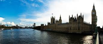
Overall, I feel the London shoot went very well and feel that I captured a successful series of images. I like how the images capture iconic areas of London and therefore help the audience to connect more to the images. I enjoyed exploring the topic of landscapes and in my first series, I took rural landscape shots but for this, I took urban landscapes in the form of London. During the trip, I enjoyed shooting for the topic but as it got dark found myself struggling. However, once I had figured out the correct camera settings, my photographs began to come out well again. I found that at night, the correct camera settings were having the f/stop at 5.6 and either putting my ISO to 400 or 600, or alternatively, putting the camera on night mode. I found that I could create more interest in the images by shooting from alternative angles and also by shooting both landscape and portrait. Below shows some images from the London shoot.


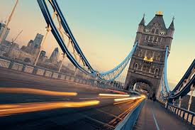
This was one of my favourite images from the London shoot. I like the colours in this image and especially like how the road has an orange tint which reflects on the interestingly shaped building. I also like how the image presents the formal element of line by means of the road. I also like how there are no cars on the road which gives the audience the feeling of dissertation which can contribute to the image giving off an uneasy feeling. I captured this image on the f/stop of 5.6 and had my camera on auto focus. 

This is one of my least favourite images from the shoot. The image was taken when it was just starting to get dark and also when I hadn't adapted my camera settings yet so this therefore makes the image appear very dark and gloomy. Also the image composition is not very good as you can see a person's face on the left hand side of the image. Also, the image is slightly out of focus and in addition to this, the cars headlights are slightly overpowering in the image. For this reason, I do not like the image and feel that it is a boring and therefore not a successful image.

Idea Development

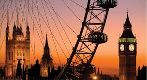
If I were to go up to London again and shoot landscapes, I would take a tripod as this could help me get more images in focus, especially when it started to get dark. In addition to this, I would go to London for a whole day so in this way I would not be limited and restricted by the fading light. I would also visit more areas in London in order to get a wider range of images in different locations which I feel would create a more broad outlook on London. If I were to shoot again and at night, I would use Rut Blees Luxemburg's night photography as inspiration. Below shows some images which I would use if I were to shoot for the topic of Landscapes in London again.


Wednesday, 20 January 2016

London Landscapes - Straight Images

London Landscapes - Straight Images

I captured these images during our trip up to London. They were all taken in the area around Trafalgar Square and Embankment. I took most of the images on f/stop 5.6 and varied between manual focus and auto focus with my ISO set at 200. However, when it started to get dark, I increased my ISO to 400 or 600 and eventually put my camera onto night mode. 

This image was taken near Trafalgar Square. I like the image as it presents many of the formal elements. It shows line in the form of the pavement as well as the buildings and road lines. I like how the pavement is a leading line which draws the eye up towards the building in the centre of the background. I also like how interest has been added to the image by the pedestrian crossing buttons. I edited the image on photoshop and adapted the curves in order to lighten the image and also increased the saturation to make the image more striking.

I like this image as I feel it presents an iconic feature of London in the form of the London eye. I like how it is in the background and lit up as this makes the background more interesting and also like how the road in the foreground has bold white arrows as this makes the image more eye-catching and also presents the formal element of lines. I also edited this image using photoshop by adapting the curves and levels.

I like this image as it shows a wide area of Trafalgar Square. I like the image as you can clearly determine where it was captured. I like the brightness of the image as it helps to make the image more striking. I also edited the image on photoshop and adapted the curves and also increased the saturation to make the image bolder and more eye-catching. 

I really like this image as it has been taken from an alternative and interesting angle. I shot it in Trafalgar Square and like the way that the image shows both the fountains as well as the steps and building in the background. I like the way that the image shows depth by the side of the fountain is not in focus whereas the water and background is. I achieved this by having my camera on manual focus with the f/stop of 5.6. Although I really like the image, I do not like how the image shows the red display in the background as this could be seen to draw the viewers eye away from the main focuses of the image which are the fountains and the building.

I also really like this image as it looks as though it has been inspired by Rut Blees Luxemburg who mainly photographs at night. When I fist took the image, I did not like how there are people in the foreground who are not in focus. However, the more I see the image, the more I like it as it could be thought to tell a story in this way. I also like how the people help to create a sense of scale of the building. 

I really like this image as the building is very interesting and I also like the way that the road is empty as this creates a feeling of desertion which to begin with, can make the audience feel uneasy. I like the way the image shows the formal element of line in the form of the road but also shows shape in the form of the interesting building. I also like how the road appears to be slightly lit up and as a result has an orange tint to it whereas the building is naturally lit so has kept its original colour. 

Landscapes - London - Contact Sheet

Landscapes - London - Contact Sheet

Tuesday, 19 January 2016

Landscapes - Work Diary

Landscapes - Work Diary

Evaluation

During the past few sessions, we were given the task of shooting for the topic of landscapes. At first, I thought that this was going to be a boring topic. However, as the topic progressed, I found that it involved more than I had first thought. I do not feel that my initial shoot was very successful as the day was very windy and this therefore made my images slightly blurry. Also, I found that I struggled to shoot a 'landscape' in Harlow. However, I thought that my second shoot was more successful and thought that I managed to explore the topic further by experimenting with different shooting angles and camera settings in order to capture more effective and interesting images. I also liked that for the second shoot, I was able to capture my images in a setting which I found inspiring and interesting. Below shows some images which I captured during my shoots.


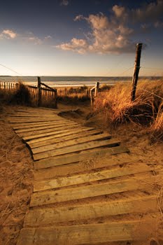
This is one of my favourite images from the shoots. I like the angle at which it was shot at as I feel it is interesting and different. I edited the image on photoshop and increased the contrast and saturation as well as adapting the curves to make the image appear brighter and therefore more effective.


I like this image as it has an additional element as well as the landscape. In my opinion, this helps to make the image more interesting and effective. I also edited the curves of this image to make it brighter which helps to make the image more striking and eye-catching.

 
This is my least favourite image from the shoot as I feel that it is very dark and does not really show a true landscape. I don't mind the silhouette effect but do not feel that the image is effective as it is also quite boring.

Idea Development

If I were to go out and shoot for the topic of landscape again, I would try to go out and shoot on a day which had more interesting weather, whether it be snow or sun. I think this would assist me in adding interest to my images. I would also be interested in attempting to capture a series of images which all related to each other and also perhaps creating a series of images which were more saturated and bright. For this, I would use the landscape photographer Helen Dixon as inspiration as I really like her images and the style in which she captures them with. Below shows some of her images which I would use as inspiration.


Landscapes - Straight Images

Landscapes - Straight Images


I like this image as it is quite original and effective. I like the sense of perspective in the image which is shown by the trees and the differing scales. I edited the image on photoshop and increased the saturation and also adapted the curves.


I like this image as it shows landscape but in an original way with the added feature of the plants in the foreground. I also edited this image by increasing the contrast and adapting the curves to make the image brighter and therefore more effective.


I like this image as it includes a leading line in the form of the ditch. I like the bright green colours in the image as it makes it appear bold and striking. I also like how the sky appears white as it makes the trees in the background stand out which therefore shows the horizon. 


I really like this image as it also includes leading lines. I like the green colours in the image and also like how the image appears mysterious and interesting.


I like this image as it captures a landscape but it is shot at an original and different angle. I like how the landscape is taken from a different perspective as it creates an unusual outlook on what would usually be a rather boring landscape.


I like this image due to the leading lines which are shown by the trees. This makes the image more effective. I edited this image on photoshop and increased the contrast and saturation and also adapted the curves of the image in order to increase the brightness of the image.


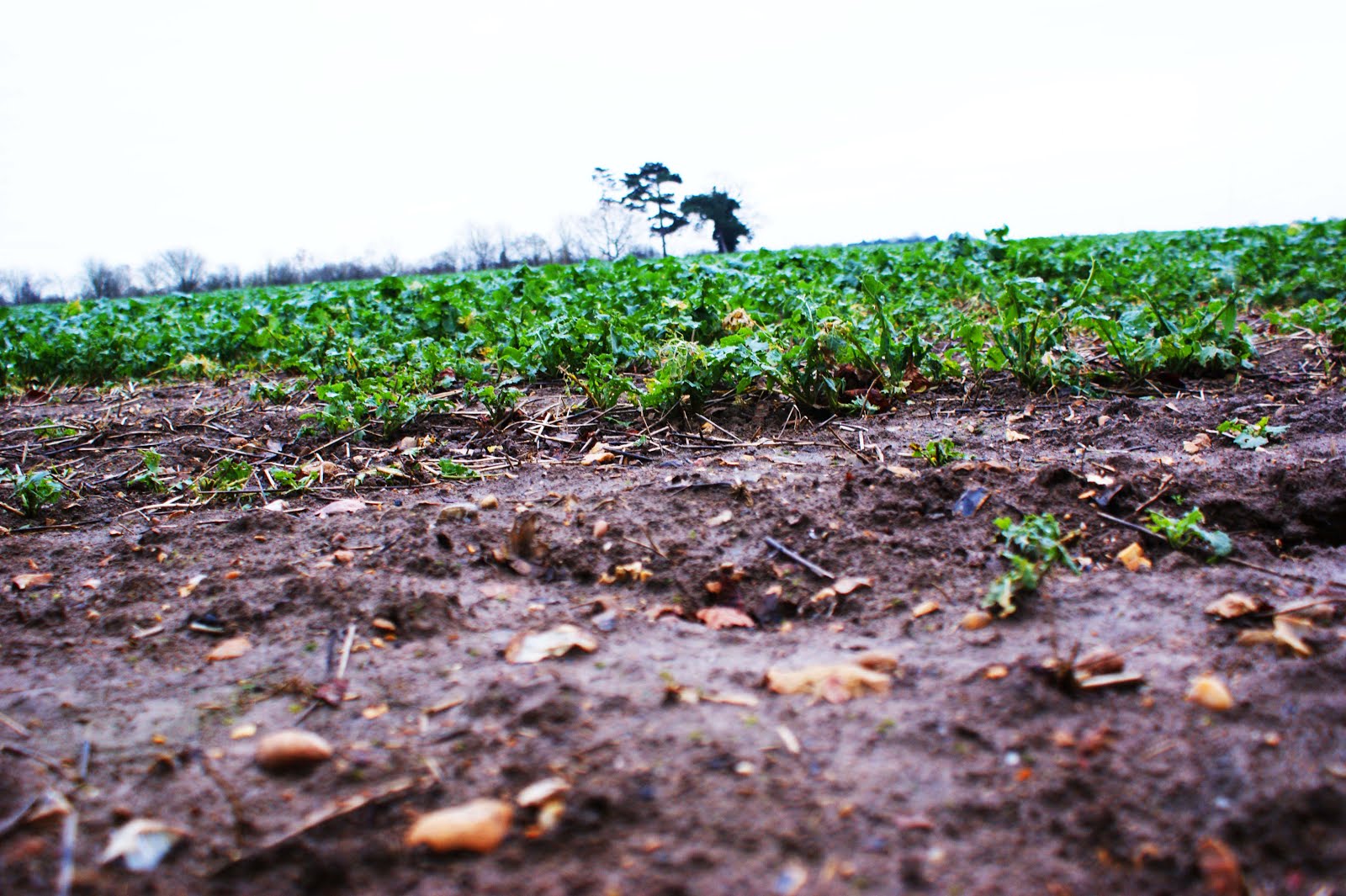
I really like this image due to the low down shooting angle and also the colours which are in the image. These colours have been made more prominent by editing the image on photoshop. They were made bolder and more striking by increasing the contrast and saturation.

Landscapes - Contact Sheet

Landscapes - Contact Sheet


Thursday, 14 January 2016

Landscape - Initial Shoot - In the style of Ansel Adams

Landscape - Initial Shoot
In the Style of Ansel Adams

Below shows a selection of images which I took during the session and edited them in the style of Ansel Adams. I like a few of the images but overall don't feel that the shoot was overly successful. I also feel the images appear a little bit gritty looking but I think that this was due to the weather. Although they do capture urban landscapes, I think that I would prefer to go out and capture rural landscapes and do so in the style of a different artist such as Helen Dixon.

I like this image as it is quite dramatic due to the dark areas in the images. I also like how the sky looks in the image as it looks similar to the sky in Ansel Adams photographs. Although I like the image, I do not feel that it shows landscape overly well. However, it could be considered to represent urban landscapes.

I quite like this image but do not feel it is successful in presenting landscape. However, I feel that this image would be good at presenting movement due to the cars in the image. 

I like this image and feel it shows a clear urban landscape. I like the dramatic black and white filter as I feel that it expresses the style of Ansel Adams quite well. I also like the way that the image appears to be taken as it was getting dark, despite the fact that the image was taken in daylight. 

I like the image but do not feel it shows landscape very well. I like the editing of the image as I feel it expresses Ansel Adam's style but do not like the image as a whole as it seems quite boring and is not a very appealing image overall and it is also very slightly out of focus. 

Landscape - Initial Shoot - Contact Sheet

Landscape - Initial Shoot - Contact Sheet

In today's session, we went out and did an initial shoot for the topic of landscape. The day was not ideal as it was extremely windy and I had to share a camera. Also, the location was not ideal as there was not much in the way of landscape near the college. However, I still managed to capture a few images during the session. 


Tuesday, 12 January 2016

Landscape Photography - Helen Dixon

Helen Dixon

Helen Dixon is a self taught photographer with her passion beginning in 2003. In 2008, she made the decision to turn her passion into a career and started it where she grew up, in the heart of Surrey. She specialises in landscape and nature photography in Southern Britain, but plans to broaden her travels. In addition, she is a regular contributor for Digital SLR Photography Magazine and here work has been widely published in a number of other magazines and newspapers. Dixon uses extensive equipment which includes: Nikon D810, E0S 5D Mkll, Sony A7R and many different lenses. 

This image is very effective at presenting landscape. It includes many different aspects such as weather in the form of the fog, the time of day which can be seen via the sky and also the nature which is present within the landscape itself. The angle at which the image has been captured is also very interesting and adds appeal to the image. The image contains multiple formal elements including depth, line and colour.

This image is very bright and also slightly dramatic due to the silhouettes of the trees on the horizon. I like the dramatic and bold colours which make up the sky as this makes the image more striking and eye-catching. I also like how the audience is able to see more detail, such as the flowers which are present in the foreground.

This image appears to be very relaxed and uniform. By means of formal elements, the image contains many lines. These are present in the trees as well as the path. In addition, the formal element of colour is very prominent due to the repeated purples and greens within the image. I like the way that the colours are very bright as this helps to make the image more appealing and interesting.

This image is very similar to the one above. However, this image includes less lines but includes different tones in the form as bright highlights and dark shadows. It also presents depth as the image gets lighter towards the back of the image. Overall I like the image and think that it has a calm and tranquil feeling to it.

I really like the normal feeling that this image gives. Although the landscape in the image is simplistic, it includes many formal elements such as depth, colour and lines. Depth is presented by the lines which lead the eye to the horizon and therefore create the feeling of distance. Depth is also shown by the fact that the colour becomes lighter towards the back of the image. The use of colour is also very effective as most of the colours are quite dull which therefore makes the green stand out more and appear very vibrant.

Landscape Photography - Artist Research

Landscape Photography - Artist Research

Ansel Adams

Ansel Adams was born in 1902 and died in 1984. He was described as being intelligent and intense yet shy and understated. He changed from pursuing music as a career to photography. Adams was born in San Francisco and was a keen naturalist, inspired by the Yosemite National Park. He took many of his photographs in the Yosemite National Park and as a result was considered to be one of the best ever landscape photographers. He was also considered to be a highly technical photographer and used the Zone System and formed the group f/64 (also a camera setting) which helped achieve great detail within his images and also influenced him to keep the images in black and white. The f/64 group was made up of 7 other photographers.

The Zone System is a way of controlling the prints' tonal range. The tonal range of the final prints is adjusted by light readings at the shooting stage, and the development at the processing stage. 

The Zone System -


Adams also used pre-visualisation which allows the photographer to see the final print before the image has been captured. This is also a technique which is used in film but it was also adopted by Ansel Adams in order to capture his landscape images.


This image appears to be very dramatic and I like the way that the image appears to have been shot at night due to the dark tones. I also like the use of depth within the image as it helps to show the format of the landscape.


This image shows an attractive landscape which includes both light and dark areas and tones within. The image includes formal elements which include, leading lines, tones as well as depth. The angle from which the image is taken is very interesting and assists in making the image more appealing.


Again, this photograph appears very dramatic and mysterious. I like the way the image includes very dark areas as well as light areas as this allows the audiences eye to be drawn to desired areas within the image. I also like how the image presents leading lines in the form of the river. This helps to draw the viewers eye up towards the main focus of the image which is the mountains. 


This image also appears to be rather dramatic. I like the way that this image shows a narrow depth of field whereby only the object in the foreground is in focus. I also like how the image appears to be misty as this gives the audience the feeling of mystery when looking at the photograph.

Stephen Shore

Stephen Shore was born in 1947 and is an American, self taught photographer who is known for his images of scenes of life in the United States. At 17, Shore met Warhol and began to frequent   Warhol's studio, photographing Warhol and the people who surrounded him. In 1971, at age 24, Shore became the second living photographer to have a solo exhibition at the Metropolitan Museum of Art.
He is also known for his original use of colour in his art photography. When Shore did his projects, he used a 8x10 view (large format) camera and by doing this, went against the small and medium scale shooters. At the same time, he went against the f/64 group (Ansel Adams) by shooting in bold and vibrant colours. Shore was also part of the group called the 'New Topographics' which were a group who focused on capturing images in a very systematic way. This may explain why Shore uses so much of the formal element of lines within his work.
I like the element of the wide angle which is used in his images. This is an aspect of his work which I would like to try and use in my work. 


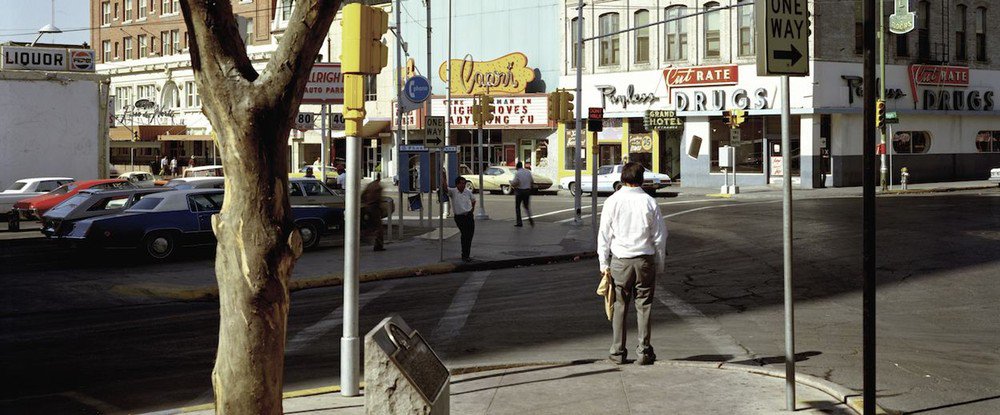
This image is very interesting as it is uniform and contains the formal element of lines in multiple ways. I like the way that the image contains both dark and light tones as this helps to create depth within the photograph of the street landscape.


This image is very simplistic but can still be considered as a landscape. I like the colours within the image as they are bright and appealing. I also like how the image gives clues about the location of the landscape due to the sky and the foreground.


I like this image as although it is quite plain, it contains more meaning than is first apparent. I like how the image contains American marketing brands as well as much of the image being in the colours of the American flag. I also like how the image is vibrant and is very uniform. The image also contains the formal element of lines in many instances.


I like this image as it is different and looks at landscapes from a more alternative perspective. I like the colours within the image as they are quite bold which makes the image appealing and eye-catching. I also like how the image contains lines. The element of lines are a common occurrence in all of Shore's images which helps in making all the images interconnect more. I also like how the colours in the images are quite saturated.