Showing posts with label Research Notes. Show all posts

Thursday, 11 February 2016

Physical Images - Artist Research

Physical Images - Artist Research

Dryden Goodwin

Dyren Goodwin is a British artist who is known for his intricate drawings which he often uses in combination with photography, film, screen based installations and soundtracks. He was born in 1971 in Bournemouth and was educated at the Slade School of Fine Art. In many of his photography works, he uses a scalpel to engrave into the photographs to create a look which appears as scars on the people which the engravements are on in the photos.

I like this image due to the added effect in the image which appears to look like water droplets. I like how the engravements in this image is in red as this looks as though there are scratches on the man's face. I like the composition of the image and like the intricate patterns which are present in the engravements. 


I like how the image is in black and white and like the more spaced out engravements in this image as it helps to make the physical edits look more obvious. I like how the edits can be used to portray the scars of the individuals which are present in the image.


I like this image as I feel it is effective how half the image is in shadow. Looking at these images makes me think it might be a nice ideas to adopt the engravement technique myself but do it on the negative space which is either side of the portrait. This may help to make the portrait face stand out more.


I like this image due to to the fact that it has lots of intricate details to it. I like how it appears to be more white due to more of the engravements. I like how this image is taken at an alternative angle to the others as this makes it look different and effective. I like how the individual in the image appears to be deep in thought as this therefore makes the image more thought provoking for the audience.

Sunday, 31 January 2016

Fourth Plinth - Artist Research

Fourth Plinth - Artist Research

Cedric Delsaux

Delsaux is a French photographer who captures series of surrealist and manipulated images. His most surreal series is one called 'Dark Lens' where he added Star Wars figures into images. Below shows some images from his 'Dark Lens' series.  

I like this image as it is very clear and the figure looks as though it belongs, though the viewer knows it really does not. I like that the two images combine very well due to their similar colour schemes and the well positioned figure.

I really like this image as it clearly combines an unrealistic image onto a real setting. I like the way the Star Wars figure is slightly hidden by the fog as this makes the image less obvious and lets the viewer find the figure of their own accord. 

I like this image as the colour schemes of the two combined images match very well which therefore leads to the two images complimenting each other very well. I also think that the scaling and shooting angles of this image works very well. 

I also like this image as it is quite mysterious and also looks very realistic, despite the viewer knowing it is not actually real. I also think that the lighting works very well within the image as it helps to draw the audiences eye to the star wars figure and also makes it look as though the figure is really there. 

Jeff Koons

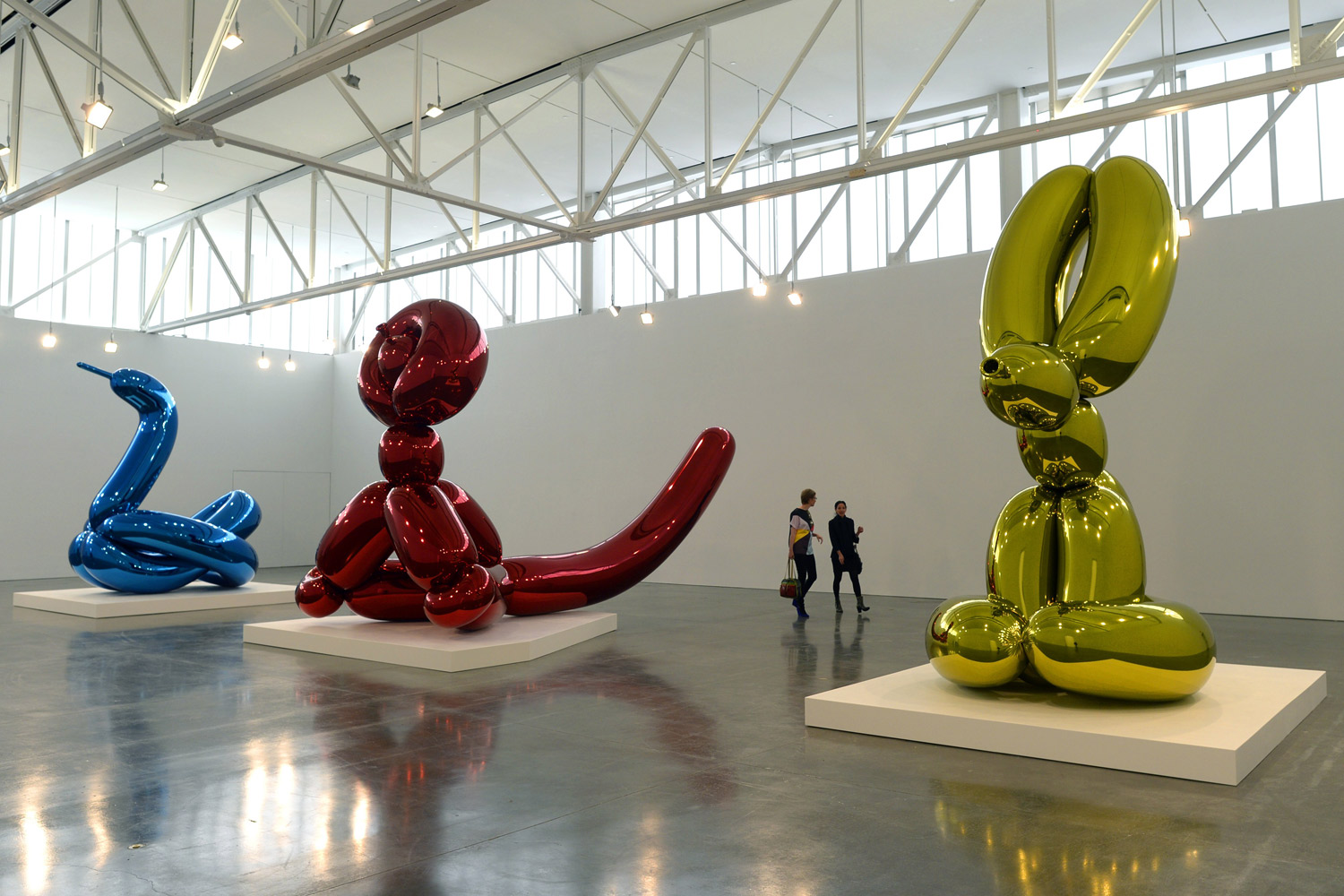
Jeff Koons was born in 1955 and is an American Artist known for his production of banal objects such as baloon animals. Koons was born in Pennsylvania and studied at the Maryland Institute College of art in Baltimore and the School of Art Institute of Chicago. He lives and works in New York City. He had his first solo exhibition in 1980 and nowadays, his work is shown in many galleries around the world. Koons is renowned for his public sculptures, and example being his monumental floral sculpture 'Puppy' which is shown at Rockefeller Center and is permanently installed at the Guggenheim Bilbao. In addition, Koons has received numerous awards and honours in recognition of his cultural achievements. During his career, he has created numerous series with an example being the Banality series. He is not actually a photographer and is in fact, considered as an artist. Koons uses his balloon animals to create surreal images which would not actually occur in real life. 

I really like the idea of the balloons as they look incredibly surreal and as a result look effective. I like this image as it shows the grand scale of the balloons by placing them in an area in which they can be compared to the people walking past.

I really like this image and think that it looks very effective as it can be compared to the people in the background. I think this image looks more effective due to the setting it is placed in as the background appears interesting and vibrant. I also like how you are able to see reflection in the balloon.

I like this image as the background is very interesting and it also adds interest to the image. I think that the artist is trying to convey the idea of a family dog outside the house within this image. I like this as an idea but the image u made interesting by the enlarged balloon dog. 

I like this image as again, it has an interesting background. I like how with this image, the shooting angle of the balloon matches that of the background. This is an essential part of the shooting process as it helps to achieve successful and effective images.

Friday, 29 January 2016

Artist Research - Julia Margaret Cameron

Artist Research - Julia Margaret Cameron - Influence and Intimacy Exhibition

During Thursday's session, we went up to London to go to some photography exhibitions which were on display in the Science Museum in South Kensington. One of the photographers who had an exhibition there was Julia Margaret Cameron. She was born in 1815 in India and was a English photographer who was well known at the time for her portraits of celebrities. The exhibition centred around the Herschel Album (1864) which was a sequence of 94 images which she considered to be her best work to date. The images consisted of expressive portraits of influential friends and family members.

Three of Julia Margaret Cameron's Images from the Exhibition -

Below are three images which were featured in the exhibition.


I liked this image from the exhibition as I thought it showed a different and original element of portraiture as I had never, until now, thought of getting an individual to look down when photographing them for portraiture. I feel that this shows a different perspective of the face and in this case looks extremely effective and thought provoking. I like the image as we are only able to see the mans face and therefore can make no assumptions of his lifestyle through looking at his surroundings or clothing. I think that this makes the audience analyse the man's feelings more deeply as there are no clues about his lifestyle or mood in the surroundings and therefore one has to look at his facial expressions. I like this image and thought it was a very effective portrait.


This image was also one which caught my eye in the exhibition. Although this image is not usually the type of photography which I like, I think it is very effective and makes you want to know or find out about the individuals lifestyle.  I like the way you are unable to see the girls setting as this makes the audience have to make an assumption about her lifestyle and feelings based on just the facial expressions and clothing. In this way, I think the image is very effective at making the audience think more carefully about the images.


This photograph was also part of the Julia Margaret Cameron exhibition. This was another of the images which caught my eye as I feel that is thought provoking as it makes you wonder what the woman in the image is both thinking and feeling. I like the composition of the image by means of the individual not looking directly into the camera and instead looking towards the bottom left corner. This ambiguous direction of the eyes makes the viewer wonder what she is looking at and as a result, start to wonder about what she is feeling and thinking about. When I examine the image, I believe that the woman is possibly in thought and is thinking about perhaps something tragic or upsetting due to the fact that she has such a solemn look on her face. Like the other images, I also like how you are unable to see the background as this forces the audience to consider deeper analysis of the individual by taking into account her clothing as well as her facial expressions and what you can see as her body language.

Evaluation

Overall, I think that Julia Margaret Cameron's images are effective and thought provoking but do not feel they are very inspirational for me personally and find them to all be quite similar to each other which for me, makes them become boring. However, I do like the natural positioning of the subjects in the photographs and also like the brown colour schemes as this would help to make some of my own images appear old like her images.

Artist Research - Alec Soth


Artist Research - Alec Soth - Gathered Leaves Exhibition

On our Thursday session, we went up to London to go to an Alec Soth (born 1969) exhibition at the Science Museum in South Kensington. The exhibition showed four of his major works - Sleeping by the Missisippi (2004), Niagara (2006), Broken Manual (2010) and Songbook (2014).
Soth is a fine artist, photojournalist, blogger and self-publisher who explores many different forms of photography. The exhibition attempted to reflect the evolution of Soth's work over the years and many of his photographs reflect the American way of life. 

Three of Alec Soth's Images from the Exhibition -

Below are three images featured in the exhibition.


This image is from Soth's series called Broken Manual. Broken Manual is a series in which Soth explores the desire to run away. Soth became interested in the world of those who are detached from civilisation and soon discovered communications with hermits, monks and survivalists. Soth chose to photograph many of these individuals in their solitude and in many of his images, creates an unnerving feeling which helps to emphasise the separation between us and them. I liked this image when I was looking round at the exhibition as it presents exactly what the series is trying to portray. I like how the individual is far away as it means that the audience cannot source his identity which makes the whole photograph have an unnerving and slightly ambiguous feel to it. I like how the man appears very insignificant in size in comparison to the trees as this helps to present the connection between him and the nature. I like the colours within the image as again, they help to convey an unnerving, mysterious feel and as a result, present the difference between us and the people in the images. I also like the way that the image and the distance between us and the subject makes the audience wonder what has happened to the individual in the image to have made them have that chosen life of solitude. 


This image is from one of Soth's series called 'Niagara' and the image is called 'Misty 2005'. In the Niagara series, Soth explored the area around Niagara falls which has long been associated with love. The series is formed by images of the area, the falls, wedding venues and portraits. With his series, he attempted to juxtapose the idea of the almighty falls with the idea of fragile love. Although I do not feel this image is the best at portraying the overall intention of the series, it is still part of it, and was the one in which I found most appealing and striking during the exhibition. I like the simplicity of the image and especially like how the dark background draws the eye to the individual. The eye is drawn even more to the individual as she appears to be wearing a bright blue swimming cap. This then makes the audience puzzle about how the individual is feeling as she appears very solemn and gloomy in the photograph. When looking at the image at the exhibition, I wondered what it had to do with the idea of fragile love but as you think about the image and meaning more, I have come to wonder if the whole reason for the subject looking so solemn is due to perhaps 'failed love'.


This image is taken from Soth's 'Sleeping by the Mississippi' series and the image is known as 'Peter's Houseboat'. This series was based not far from Soth's birth place and within it, Soth travels a 2000mile course southwards towards the Gulf of Mexico, taking photographs at each location on his journey. The series includes photographs of the boyhood homes of the likes of Johnny Cash and Charles Lindbergh. The series attempts to capture a sense of imagination and dreams, something which Soth managed to capture in many of the photographs in the series. This was the image from the series which caught my eye in the exhibition and although simplistic in comparison to some of the others, I thought it was very effective and captured the mood and ideas of the series very well. Firstly, I like the composition of the photograph by means of the fact that the house is positioned to the right hand side of the image which allows a very blank space on the opposite side. I think this looks effective and in my opinion, the white of the snow captures the sense of imagination which Soth was attempting to portray in the images in the series. I feel the image may be trying to suggest the dreams of the person living in the house as well as capturing the idealistic and striking area around it. 

Evaluation

Overall, I like the images which were featured in Alec Soth's exhibition called 'Gathered Leaves'. I think they are all effective and each show a different and unique story. I also like how each of the images are thought provoking and each present a different type of lifestyle or show a different concept or idea. I found the photographs in the exhibition very inspirational and will use them to inspire my own photography. I especially liked Soth's landscape photos as well as portraits as I like both the compositions of them and the stories which they suggest and present.

Tuesday, 12 January 2016

Landscape Photography - Helen Dixon

Helen Dixon

Helen Dixon is a self taught photographer with her passion beginning in 2003. In 2008, she made the decision to turn her passion into a career and started it where she grew up, in the heart of Surrey. She specialises in landscape and nature photography in Southern Britain, but plans to broaden her travels. In addition, she is a regular contributor for Digital SLR Photography Magazine and here work has been widely published in a number of other magazines and newspapers. Dixon uses extensive equipment which includes: Nikon D810, E0S 5D Mkll, Sony A7R and many different lenses. 

This image is very effective at presenting landscape. It includes many different aspects such as weather in the form of the fog, the time of day which can be seen via the sky and also the nature which is present within the landscape itself. The angle at which the image has been captured is also very interesting and adds appeal to the image. The image contains multiple formal elements including depth, line and colour.

This image is very bright and also slightly dramatic due to the silhouettes of the trees on the horizon. I like the dramatic and bold colours which make up the sky as this makes the image more striking and eye-catching. I also like how the audience is able to see more detail, such as the flowers which are present in the foreground.

This image appears to be very relaxed and uniform. By means of formal elements, the image contains many lines. These are present in the trees as well as the path. In addition, the formal element of colour is very prominent due to the repeated purples and greens within the image. I like the way that the colours are very bright as this helps to make the image more appealing and interesting.

This image is very similar to the one above. However, this image includes less lines but includes different tones in the form as bright highlights and dark shadows. It also presents depth as the image gets lighter towards the back of the image. Overall I like the image and think that it has a calm and tranquil feeling to it.

I really like the normal feeling that this image gives. Although the landscape in the image is simplistic, it includes many formal elements such as depth, colour and lines. Depth is presented by the lines which lead the eye to the horizon and therefore create the feeling of distance. Depth is also shown by the fact that the colour becomes lighter towards the back of the image. The use of colour is also very effective as most of the colours are quite dull which therefore makes the green stand out more and appear very vibrant.

Landscape Photography - Artist Research

Landscape Photography - Artist Research

Ansel Adams

Ansel Adams was born in 1902 and died in 1984. He was described as being intelligent and intense yet shy and understated. He changed from pursuing music as a career to photography. Adams was born in San Francisco and was a keen naturalist, inspired by the Yosemite National Park. He took many of his photographs in the Yosemite National Park and as a result was considered to be one of the best ever landscape photographers. He was also considered to be a highly technical photographer and used the Zone System and formed the group f/64 (also a camera setting) which helped achieve great detail within his images and also influenced him to keep the images in black and white. The f/64 group was made up of 7 other photographers.

The Zone System is a way of controlling the prints' tonal range. The tonal range of the final prints is adjusted by light readings at the shooting stage, and the development at the processing stage. 

The Zone System -


Adams also used pre-visualisation which allows the photographer to see the final print before the image has been captured. This is also a technique which is used in film but it was also adopted by Ansel Adams in order to capture his landscape images.


This image appears to be very dramatic and I like the way that the image appears to have been shot at night due to the dark tones. I also like the use of depth within the image as it helps to show the format of the landscape.


This image shows an attractive landscape which includes both light and dark areas and tones within. The image includes formal elements which include, leading lines, tones as well as depth. The angle from which the image is taken is very interesting and assists in making the image more appealing.


Again, this photograph appears very dramatic and mysterious. I like the way the image includes very dark areas as well as light areas as this allows the audiences eye to be drawn to desired areas within the image. I also like how the image presents leading lines in the form of the river. This helps to draw the viewers eye up towards the main focus of the image which is the mountains. 


This image also appears to be rather dramatic. I like the way that this image shows a narrow depth of field whereby only the object in the foreground is in focus. I also like how the image appears to be misty as this gives the audience the feeling of mystery when looking at the photograph.

Stephen Shore

Stephen Shore was born in 1947 and is an American, self taught photographer who is known for his images of scenes of life in the United States. At 17, Shore met Warhol and began to frequent   Warhol's studio, photographing Warhol and the people who surrounded him. In 1971, at age 24, Shore became the second living photographer to have a solo exhibition at the Metropolitan Museum of Art.
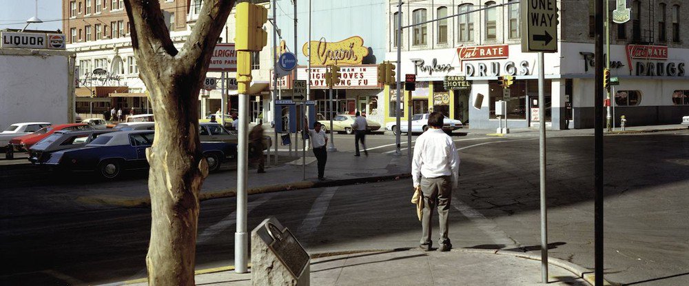
He is also known for his original use of colour in his art photography. When Shore did his projects, he used a 8x10 view (large format) camera and by doing this, went against the small and medium scale shooters. At the same time, he went against the f/64 group (Ansel Adams) by shooting in bold and vibrant colours. Shore was also part of the group called the 'New Topographics' which were a group who focused on capturing images in a very systematic way. This may explain why Shore uses so much of the formal element of lines within his work.
I like the element of the wide angle which is used in his images. This is an aspect of his work which I would like to try and use in my work. 


This image is very interesting as it is uniform and contains the formal element of lines in multiple ways. I like the way that the image contains both dark and light tones as this helps to create depth within the photograph of the street landscape.


This image is very simplistic but can still be considered as a landscape. I like the colours within the image as they are bright and appealing. I also like how the image gives clues about the location of the landscape due to the sky and the foreground.


I like this image as although it is quite plain, it contains more meaning than is first apparent. I like how the image contains American marketing brands as well as much of the image being in the colours of the American flag. I also like how the image is vibrant and is very uniform. The image also contains the formal element of lines in many instances.


I like this image as it is different and looks at landscapes from a more alternative perspective. I like the colours within the image as they are quite bold which makes the image appealing and eye-catching. I also like how the image contains lines. The element of lines are a common occurrence in all of Shore's images which helps in making all the images interconnect more. I also like how the colours in the images are quite saturated. 

Tuesday, 15 December 2015

Artist Research - Documentary Photography

Artist Research - Documentary Photography

Henri Cartier-Bresson -

Henri Cartier-Bresson is was a French photographer who assisted in the development of street photography and was the co-founder of Magnum Photography. In addition to this, he is referred to as the father of modern photojournalism. The three images below come from Henri Cartier-Bresson's documentary series; The Decisive Moment. The Decisive Moment has been defined as a photograph which is taken at a precise moment which depicts the entirety of a story or action. 


Ed Thompson

Ed Thompson is a British photographer and his work focuses on different cultures and lifestyles. His work focuses on many different areas and he is mostly known for his documentary style photography. The three images below come from one of his documentary series known as Cowboy Church.


Comparison -

The two photographers and the way that they present their documentaries are very different. Firstly, Henri Cartier-Bresson obviously photographs in black and white whereas Thompson captures his images in colour. In addition to this difference, Thompson seems to stay with his topic more whereas Cartier -Bresson appears to stray further away from the original topic. In my opinion, I think that Thompson's work is more effective as it is easier to see what he is documenting as the images that he has captured are closer to the original topic and all the images relate more to each other. In comparison to this, Cartier-Bresson's images appear to be less related to each other and it is more difficult to see what is being documented by just looking at the images whereas you are able to detect a type of Western American theme when you look at Thompson's work, even when you are unaware of the actual topic of documentary.

Documentary Photography - Edward Thompson

Documentary Photography - Edward Thompson

Ed Thompson is a British Photographer who focuses on Documentary. I really like his work and am hoping to use it as inspiration when I capture my own series of documentary photographer. I like all his sets of work but my particular favourite set is the one called 'Cowboy Church'. I feel that this set of documented images are very effective and interesting and feel that they clearly present the topic in which they are supposed to be documenting. I really like the series as it shows a lot about the lifestyle of the people in the images, for example, it shows the weather, their surroundings, their clothing and their activities.

Below shows some of the images that are included in the 'Cowboy Church' documentary photography series.


Tuesday, 24 November 2015

Portraiture - Artist Research

Portraiture - Artist Research

The two following artists are rather similar in many ways. For example, they both capture portraits, mainly featuring celebrities. However, they do this in different ways. Lachapelle captures the images in a rather eccentric and striking manner which is shown through his use of bold colour schemes and compositions, as well as the elaborate make up which he uses on his subjects. However, Leibovitz captures her images in a much more subtle way and often portrays her subjects as thoughtful, or suggests hidden and deeper meanings of the individuals identities within her portraits. In my opinion, I think that Lachapelle's portraits are more interesting as they attract your attention due to the bold and eye-catching colours and compositions used. 

David Lachapelle

Lachapelle was born in 1963 and is an American commercial photographer, fine art photographer, music video director and artist. He is best known for his photography which often references art history and sometimes presents social messages. He also photographs many celebrities. Lachapelle's career began in the 1980's when he began to show his images in New York Art Galleries. His work caught the eye of Andy Warhol who offered him a job at Interview Magazine. Below shows some portraits that he has captured of celebrities. I really like how he uses setting, makeup and clothing and expressions to give the audience an idea as to the personalities of the individuals.

This photograph of Madonna is very interesting as he has used light trails to create a crown above her head. This crown could be considered to be symbolic or may not be. I like the way that in the image, she appears very natural and relaxed. I also like the dark purple backdrop as I feel that this makes the image feel more permanent and calm.

I like this image as I think that the photographer is trying to portray the individual as being fun and energetic. He portrays these feelings by using the pink background and having the subjects expressions and hair and make up in such a way that suggests youth and energy. 

The way that this image is presented suggests a more dark and solemn feel to the way that the individual is presented. The dark eyes and the abundance of red in the image suggests sadness and gives a slightly gothic feel to the overall image. I also think that the blood on one of the fingers could possibly have a symbolic meaning and could suggest something about the individuals personality. The way that the subject is posing suggests that she is deep in thought and also supports the previous assumptions about what the photographer is trying to portray.


This image is very interesting as it shows an original way of presenting a portrait. I like the element of surrealism in the image and it makes the audience feel as though the subject is most likely to be a fun and interesting person.


Annie Leibovitz

Annie Leibovitz was born in 1949 and is an American portrait photographer. During her career, she has worked for the Rolling Stone Magazine, Vanity Fair and has also worked with a number of high profile advertising campaigns. In recent years, Leibovitz has focused her work on capturing a range of interesting images of celebrities and has worked with many very famous celebrities including John Lennon.

This image features the singer Adele. From the image, Leibovitz portrays her as a glamorous and slightly mysterious figure. She conveys the idea of mystery by positioning the subject to the right hand side of the frame and using her hair to show movement although her face and facial expressions appear to be calm and stationary. This therefore portrays an element of mystery within the image. I also like how the image uses a black and white filter as this helps the audience to focus on the actual face rather than looking at the colours that are in the photograph.


This image depicts Angelina Jolie. In my opinion, it presents her as being calm and thoughtful. The subject appears calm as there appears to be very little movement in the image and the facial expressions seem to show that she is calm and relaxed and the hand on the face could be thought to depict thoughtfulness. Again, I feel that the black and white filter helps the audience to focus more on the actual face presented rather than the colours.


This image shows Meryl Streep in a more unconventional form. I think that the image could be trying to present the many characters that she has acted as due to the idea of the mask within the image. This makes the audience think about the subject more deeply than just their mood in the image as it encourages the audience to think about the individuals life and achievements as well as how they are being portrayed in the photograph.