Reflection (studio and indoor shoot) (Framing) - Straight Images
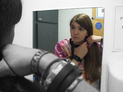
I really like this image as it shows framing very well. I really like how you can see the back of the persons head as well as the front in the reflection.
I then edited my image using photoshop and used colour manipulation to make the reflection in colour and the rest in black and white. I also really like that it makes the reflection more obvious and eye-catching.
I really like this image as it shows framing very well. It is similar to the above image and for this reason, feel that it looks very effective. I really like how the reflection is in focus and the area of the hand is not. This makes the reflection more eye-catching.
I then edited my image using photoshop and chose to manipulate the colour so that the whole frame was in colour while the rest of the image is in black and white. This therefore draws the eye more to the element of the reflection which is framed in the form of the mirror.
Although this image does not show framing, I feel it shows reflection well through the element of the colours. I shot this image in the studio and feel that it turned out well due to how the colours were being reflected onto the persons arm. I did not edit this image as I felt the image was more effective in its original form.
I took this image in the studio and really like how the light catches on the sides of the mirror. This makes the framing element more obvious in the image and therefore draws attention to the reflection in the mirror. However, in this original version, I do not like the orange tones as I feel it detracts from the element of reflection.
I then edited my image on photoshop and gave the image a black and white filter. I feel that this makes the frame within the image more obvious due to the darker tones which surround the mirror. This therefore helps to make the element of reflection more eye-catching.
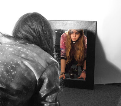
I really like this image as I feel it shows the element of reflection and framing very well. I really like how both the real figure and the reflected figure are in focus as this creates more interest in the image due to the audience having multiple things to look at. I took the image in the studio and manipulated the light in such a way that I got a shadow on the right hand side of the image.
I then edited my image using photoshop. I used colour manipulation to make the reflection more eye-catching and bold as it stood out against the black and white background. I also cropped the image as I felt it had too much spare space on the right hand side.


No comments:
Post a Comment