Shape - Straight Images
I likre this image as it shows a very interesting shape. I also like how the red in the leaf stands out against the green background as this therefore makes the shape in the leaf more apparent and prominent and will therefore draw the viewers eye to the main focus point in the image which is the leaf.
This image was inspired by the image in my image bank by Kim Hopf. When I was shooting, I attempted to make the image seem more pyramid shaped by shooting from a corner and looking up. I think the image has turned out very effective and I really love the shapes that have been created.
I experimented with my image on photoshop and made it black and white. I really like this version of the image and think that the removal of the colour adds a dramatic feel to the image, especially due to the clouds above the building which look more bold with the black and white filter. I much prefer this version of the image as it allows the viewer to focus more on the element of shape rather than the colours. I also think that the simple black and white filter allows the image to portray more feeling and be more bold and eye catching.
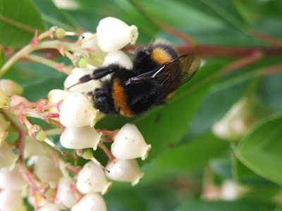
I really like this image and was very lucky to get this shot. I was photographing the little white flowers, as I think that they present shape very well, when the bee landed on them. I think the bee also helps to portray shape due to the elaborate shape and pattern on the wing which you can just see in the image. I also think that it has added interest to the flowers and therefore allows the viewers eye to focus on the little flowers more which present very intricate little shapes. I have not edited this image at all as I feel it looks very effective in its original colours and the white of the flowers allows the viewers eye to be drawn into them as the main focus of the image.
I really like this image due to the spherical shape against the sky. I think that the coloured background adds interest to the photo and allows the eye to recognise the top of the lamp as the main focus point of the image. However, I feel that the original version of this image (above) appears quite basic and lacks creativity and imagination.
I have edited the image on photoshop and have changed the colour of the sky to give the photo a slightly surreal and fantasy feel to it. The simple altering of the colour of the sky has, in my opinion, completely changed the image, and has made it much more eye catching and therefore draws the viewers eye more to the main element of shape which is presented in the image.
With this image, I was inspired by one of the images in my image bank. Although this is a less detailed version, I feel that overall the same theme has been captured. Like the photo in my image bank, I like the way that different shapes can be seen from the image as this creates interest to the image. If I were to photograph this again, I would try to get the shape more symmetrical in the frame as I think this would make the presented shapes more prominent and eye catching to the viewer.


No comments:
Post a Comment