Joiners - Straight Images
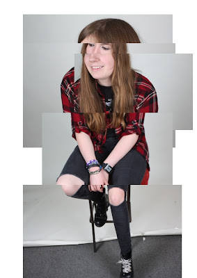
This is my first attempt at a joiner. I captured the images for this in the studio and like the lighting in the images as they help the images to appear clear and help the colours be quite bright. For my first attempt, I think that the joiner is quite successful and I like the distorted element of the image as it helps to create a more surreal feeling.
I experimented further with the photo joiners in photoshop and adapted the background colours. I thought that black would have be a good colour to experiment with due to the colour of the subjects trousers. However, I prefer the original image.
This was another attempt at a joiner. I took the images in the studio and this time, only used 5 layers. In my opinion, the image looks a bit strange, but I think this is because I am not used to looking at photographs in this way. I like the distorted element of the joiner as I think that it makes the image more eye-catching. In someways, I quite like the fact that the image at the bottom goes off the white background as it creates an elongated feel. Overall, I am quite pleased with the outcome considering it was my second attempt at creating a joiner.
I also experimented with this image and made the background the same colour as the subjects clothing. I think that this image looks effective as the background compliments the individuals clothing.
This is a more simple example of a joiner as it only includes three layers. However, I made the image more effective by using rotations and also using a black and white filter. This filter helps the viewer to distinguish between the images due to the different tones that are shown. I really like this image and also created another version of it where the photographs were angled slightly differently.
For this edit, I also used the curves tool to edit the image further. This helped to make the building darker which helped with the boldness and therefore leads to the eye being more drawn towards the building as the main focus point.
This image shows more of a landscape which was created using joiners. Again, the joiner is more simplistic and only uses three layers but I still think it looks quite effective. With this joiner, I also used slight rotations on some of the images to make the overall image more interesting and eye-catching.
This image also shows a landscape scene. This joiner is formed from four layers and does not include any rotated images. This more uniform effect makes the image appear more organised and therefore helps to make it more aesthetically pleasing. Although I think the image looks effective, I do not think it is as interesting and striking as my other joiners that I have made.
This joiner is made of approximately 5 layers. I think the image is effective as it combines a good amount of images and uses them at different angles within the image to give the most effective appearance. I think the image is very striking but do not like the great variation in colour between the images. This variation is especially noticeable on the bottom two images as the one at the very bottom is very bright, while the one above is quite noticeably darker.
Due to the variations in colouring, I decided to edit the image using a black and white filter to reduce the effect of the different colours. I think that this image looks quite effective and I like the way that the branches of the trees stand out and are bold against the light background.


No comments:
Post a Comment