Friday, 27 November 2015

Connecting Essay 2

Connecting Essay 2 - Portraiture

Thomas Ruff's Photograph -


This image was taken by Thomas Ruff and shows portraiture. I used this image for inspiration when I was shooting for the topic and captured a similar image myself. The image shows an bold and colourful background which helps to add interest to the image and makes the portrait more eye-catching. The subjects expression in the portrait is deadpan and this stops any assumptions being made about the subjects feelings. In this way I think that this is effective as it makes the image quite thought provoking for the audience. I also like the bold background as it helps to draw the viewers eye to the figure as it stands out against the bright colours. 

My Photograph -


This is my image which shows portraiture. I like how the subject is positioned as it clearly shows their mood and feelings. I also like how the subject appears to have been caught off guard and therefore appears natural and relaxed. I edited my image using photoshop and increased the contrast as well as adapting the curves. I like the image as it is bold and striking. In addition to this, I like how the subjects clothing looks against the background as it is less attention grabbing. 

The Connection -

The two images are not completely identical but have a number of obvious similarities. The main similarity between the two is that they both present the topic of portraiture. However, they do this in slightly different ways as the subject in Thomas Ruff's photo is deadpan whereas the subject in my photo is showing a thoughtful expression. Another obvious way that the two connect is the fact that both of them have the same bold and striking background colour. I like the use of this bright background as it makes the subject and therefore the element of portraiture stand out more. In addition to this, it draws in the viewers eye and makes the subject more defined which therefore makes the two images successful at presenting portraiture. The background also makes them successful images as it stops the audience being able to analyse the subjects mood based on the background or setting and it therefore makes the audience have to study the subject to allow them to determine mood and feelings. 

Thursday, 26 November 2015

Portraiture - Work Diary

Portraiture - Work Diary

Evaluation

In the sessions this week, we were given the task of exploring the topic of portraiture. At first, I thought that this was going to be quite a boring topic but as the sessions progressed, found that I was able to produce some effective and striking images. In Tuesday's session, I focused on taking images in the studio where I tried to work in the style of Richard Avedon and Thomas Ruff. In Thursday's session, we went out and captured portraits on location. I found that shooting on location was much more enjoyable as I was able to capture more natural expressions of my subjects and found that the individuals being photographed were more relaxed and therefore easier to capture in my images. I also enjoyed experimenting with the different backgrounds that were available and also the shallow depths of field in my images, as these aspects helped to add interest to my images. In addition, I found that being able to manipulate the depth of field helped me to adapt and add interest to my images. I was able to manipulate the depths of fields by having my camera on aperture priority mode and setting a low f/stop if I wanted a shallow depth of field and setting a higher f/stop if I wanted to get a wide depth of field. Below shows some images which I captured during this weeks sessions on portraiture.

I really like this image and feel as though it could be considered as being connected with the image below. I edited this image using photoshop and altered the curves as well as increasing the saturation to obtain a more striking and bold image. I also like how the subject is not face on as the image therefore presents an alternative perspective of portraiture in the form of a side on angle. This is one of my favourite images and was captured during Thursday's location shoot.

I really like this image and like the way that the subject is natural and not looking directly at the camera. I altered this image using photoshop and increased the brightness, increased the saturation and also altered the curves to make the image vibrant and make the subjects skin bright so that they stand out more. This is another of my favourite images from the shoots on portraiture.

This image presents a screenshot of the photoshop page from when I edited the image above and on the right hand side, shows the layers that I added. 

This is one of my least favourite images from the sessions on portraiture. Although there is nothing specifically wrong with the image, I feel that the actual element of the portrait is detracted from due to the background and foreground which, in my opinion, is too busy. I feel like the image would have more successful had the subject been positioned in a plainer looking setting.


Idea Development

If I had the opportunity to go out and shoot for the topic of portraiture again, I would attempt to produce a range of images which featured the same subject but in different situations. I think that this would be effective as I feel as though the images would interconnect with each other and be more interesting. I would also try to photograph more people in their natural setting as I feel that this helps to add interest to the images and also helps for the audience to work out and have a better idea of the subjects identity. I would also experiment more with my images in photoshop and would perhaps try black and white filters on them as I feel that this would make the images effective and also would show various tones within the faces which would make the images more eye-catching and appealing to their audiences. Below shows some images which I would use for inspiration if I were to shoot for this topic again. 


Portraiture - Straight Images - Best 5

Portraiture - Straight Images - Best 5

I really like this portrait which I captured during the shooting on location session. I like how the image shows a shallow depth of field. I achieved this depth of field by having my camera on aperture priority mode and having my f/stop set to the value of 5.6 which helped me to focus on the subject and have the background blurred. I like the way that the subject is in a natural pose and is not looking at the camera as this makes for a more realistic portrayal of emotion.


I really like this image and like the way that, again, the subject is natural and not looking directly at the camera. I altered this image using photoshop and increased the brightness, increased the saturation and also altered the curves to make the image vibrant and make the subjects skin bright so that they stand out more.

I also like this image and feel as though it could be considered as a follow on from the image above. I also edited this image using photoshop and altered the curves as well as increasing the saturation to obtain a more striking and bold image. I also like how the subject is not face on as the image therefore presents an alternative perspective of portraiture in the form of a side on angle. 

I like this image and feel that the shallow depth of field helps to add interest to the image as well as drawing the viewers eye to the face in the foreground. I edited this image on photoshop by altering the curves to make the subject brighter and also increased the overall brightness. In addition to this, I used a technique known as vignette to make the centre of the image brighter to assist the audiences eyes being drawn to the centre and main focus point of the image.  For this image, I used the camera on aperture priority and set the f/stop to 4 in order to achieve the shallow depth of field.

I like this image as I feel it shows a relaxed individual in their natural setting very well. In this way, the image could be thought to resemble that of Alec Soth. I also like the way that the image shows a narrow depth of field which I achieved by using the f/stop value of 5.6. I also edited this image in photoshop and increased the saturation as well as increasing the overall brightness of the image.

Portraiture - Contact Sheet

Portraiture - Contact Sheet


Tuesday, 24 November 2015

Portraiture (studio) - Straight Images - Best 5

Portraiture - Straight Images - Best 5

The three images below were inspired by Thomas Ruff's work. He uses colourful backgrounds and also uses only head and shoulder shots to create his portraits. I really like the three images below as they show a variety of different emotions portrayed by the same subject. 

I like this image as I feel it suggests that the subject is surprised. I like the way that the subject is positioned to one side of the frame as it creates effect and makes the image more interesting and attractive. I edited my image in photoshop and adjusted the curves and also sharpened the image.


I like this image as it looks as thought the subject is deep in thought. Again, I like the way that the subject is positioned towards the right hand side of the frame and also like the way that they are not looking directly at the camera. I edited my image in photoshop by adjusting the curves to make the image brighter and also increased the sharpness of the image.

I also like this image as I think that the subject appears to be stressed. Although in real life it is likely that the subject didn't feel this way, the image shows a strong connection with this emotion due to the fact that the person is looking up and also has their hands raised towards their head. 


The two images below were taken in the style of Richard Avedon. I think the way that he captures and edits images is effective and think that the usual black and white filter he applies makes the images more attractive and eye-catching. 

I like this image as it uses a prop to add more interest to the image. I like the black and white theme which is present in the image due to the subject wearing black clothes and the background being white. 

To make my images more like the images by Richard Avedon, I added a black and white filter to my image and also altered the curves. I like the outcome as I feel that the photograph now looks more in the style of the artist I was trying to capture the style of. 

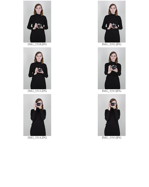
I also like this image as it relies on more interpretation due to the fact that the subject's face is covered by the camera. Again, I like the addition of the prop as it helps to add interest to the image and therefore helps to attract the audience's eye more. 

Again, here I added a black and white filter and adapted the curves of the image and really like the outcome as I feel that it now portrays the style of Richard Avedon more accurately.

Portraiture (studio) - Contact Sheet

Portraiture - Contact Sheet


Portraiture - Artist Research

Portraiture - Artist Research

The two following artists are rather similar in many ways. For example, they both capture portraits, mainly featuring celebrities. However, they do this in different ways. Lachapelle captures the images in a rather eccentric and striking manner which is shown through his use of bold colour schemes and compositions, as well as the elaborate make up which he uses on his subjects. However, Leibovitz captures her images in a much more subtle way and often portrays her subjects as thoughtful, or suggests hidden and deeper meanings of the individuals identities within her portraits. In my opinion, I think that Lachapelle's portraits are more interesting as they attract your attention due to the bold and eye-catching colours and compositions used. 

David Lachapelle

Lachapelle was born in 1963 and is an American commercial photographer, fine art photographer, music video director and artist. He is best known for his photography which often references art history and sometimes presents social messages. He also photographs many celebrities. Lachapelle's career began in the 1980's when he began to show his images in New York Art Galleries. His work caught the eye of Andy Warhol who offered him a job at Interview Magazine. Below shows some portraits that he has captured of celebrities. I really like how he uses setting, makeup and clothing and expressions to give the audience an idea as to the personalities of the individuals.

This photograph of Madonna is very interesting as he has used light trails to create a crown above her head. This crown could be considered to be symbolic or may not be. I like the way that in the image, she appears very natural and relaxed. I also like the dark purple backdrop as I feel that this makes the image feel more permanent and calm.

I like this image as I think that the photographer is trying to portray the individual as being fun and energetic. He portrays these feelings by using the pink background and having the subjects expressions and hair and make up in such a way that suggests youth and energy. 

The way that this image is presented suggests a more dark and solemn feel to the way that the individual is presented. The dark eyes and the abundance of red in the image suggests sadness and gives a slightly gothic feel to the overall image. I also think that the blood on one of the fingers could possibly have a symbolic meaning and could suggest something about the individuals personality. The way that the subject is posing suggests that she is deep in thought and also supports the previous assumptions about what the photographer is trying to portray.


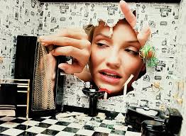
This image is very interesting as it shows an original way of presenting a portrait. I like the element of surrealism in the image and it makes the audience feel as though the subject is most likely to be a fun and interesting person.


Annie Leibovitz

Annie Leibovitz was born in 1949 and is an American portrait photographer. During her career, she has worked for the Rolling Stone Magazine, Vanity Fair and has also worked with a number of high profile advertising campaigns. In recent years, Leibovitz has focused her work on capturing a range of interesting images of celebrities and has worked with many very famous celebrities including John Lennon.

This image features the singer Adele. From the image, Leibovitz portrays her as a glamorous and slightly mysterious figure. She conveys the idea of mystery by positioning the subject to the right hand side of the frame and using her hair to show movement although her face and facial expressions appear to be calm and stationary. This therefore portrays an element of mystery within the image. I also like how the image uses a black and white filter as this helps the audience to focus on the actual face rather than looking at the colours that are in the photograph.


This image depicts Angelina Jolie. In my opinion, it presents her as being calm and thoughtful. The subject appears calm as there appears to be very little movement in the image and the facial expressions seem to show that she is calm and relaxed and the hand on the face could be thought to depict thoughtfulness. Again, I feel that the black and white filter helps the audience to focus more on the actual face presented rather than the colours.


This image shows Meryl Streep in a more unconventional form. I think that the image could be trying to present the many characters that she has acted as due to the idea of the mask within the image. This makes the audience think about the subject more deeply than just their mood in the image as it encourages the audience to think about the individuals life and achievements as well as how they are being portrayed in the photograph.

Portraiture - Image Bank

Portraiture - Image Bank


I really like this image as the idea of the half face which is shown by the misted up window. I also like the added element of the water droplets as they add more interest to the image. I also like how the child that is being photographed appears very natural and looks to be curious according to their facial expressions. 

I really like this image as the colours are very warm so make the image seem appealing and attractive to the eye. I like how the child in the image, again seems natural and I also like how they are positioned to  one side of the image rather than them being completely central.

I really like the expression shown in this image as it is original and interesting. I like how the image has a black and white filter on it as this helps with presenting the tones and shades within the image, 

I like the originality of this image and think that what appears to be coloured glitter, helps to add colour to the photograph. It also helps to make the image more interesting and the addition of the colour to the image helps to draw the viewers eye to the portrait.

This image was taken by photographer Thomas Ruff. I really like how the image includes a colourful background as this attracts the viewers eye to the image and makes the portrait stand out more. In addition to this, the coloured background makes the image have a pop-art feel to it which therefore helps to make the image more attractive and striking.

I really like this image which was captured by Richard Avedon. I like the fact that the image is a half body shot as this, in some cases, can add interest and effect to the portrait as it gives the audience more to look at. In the case of this image, the fact that the portrait is a half body shot helps the audience to assess the individual in the image and by showing more of the subject, helps the audience to create an understanding about the sort of person that is being depicted.

Define - Portraiture

Define - Portraiture

Portraiture - The art of painting or taking portraits.

My interpretation is that portraiture is a painting, drawing or photograph which focuses on an individual. It is usually predominantly of the face which helps to portray emotion and expression. 

Four Annotated Images

I really like how this portrait is original and shows an edit which adds interest to the image. I also like how this edit gives the idea of surrealism.  


I like this portrait and think the way that the light is used and the colours around the face makes the image more appealing. This therefore shows the importance of the framing used in addition to the actual portrait.

I like how this portrait is made up of multiple faces as it creates a more abstract interpretation of portraiture. I also like the way that the image is in black and white as this shows tones within the faces. 


This image shows emotion and mood very well. I really like the fitter that has been applied to the image as it helps to show the various tones which are present in the face of the subject which helps to make the image more interesting.

Friday, 20 November 2015

Connecting Essay 3

Connecting Essay 3 - Photojoiners

David Hockney's Photograph -

This image was captured by David Hockney and is a joiner. I like the use of the many images from different angles and different scales being combines in close proximity and I think that the use of the many images looks much more effective than if there were less photographs. I like how this joiner explores the face and human form as it, in a way, presents a different form of portraiture. I like how the images are in full colour and also like the background colour as it compliments the photographs. 

My Photograph -
This is my joiner which I created using multiple images. I like the varying scales and sizes of the photographs as this makes the overall image look more effective and interesting. I like how the audience can tell that the images fit together somewhat as this helps to create a more distorted look. I like how the background colour compliments the images as I think that the white helps to make the figure stand out more in the photograph. I also like how the photographs have been lit as I took them in the studio.  

The Connection -

Although the two images are not 100% connected, they still have some very similar aspects. The main difference between the two is that Hockney's image only shows the individuals face whereas my image shows the full body. The connection between the two is that they both show multiple images of a person which are put into a photo joiner. They also connect as the images have light backgrounds which look effective as it allows the audience to see the individually placed images which helps to make the images more effective as photo joiners. Also, although my image is more simplistic in comparison to the joiner by Hockney, they still both possess some very similar properties which include the individual photographs being taken at varying angles and with different scales in order for the joiners to look interesting and striking.