Tuesday 29 September 2015

Form - Work Diary

Form - Work Diary

Evaluation

In Tuesday's session, I went out to photograph for the topic of 'form'. To begin with, I was unsure as to what I was going to photograph, but as the session went on, I found that there was some type of form everywhere I looked. I mostly enjoyed photographing examples of natural form as it allowed me to experiment with macro mode on the camera and get some close ups which I found very enjoyable. I found that I took lots of photos during the session for form as I found form almost everywhere that I looked. Below shows some examples of images that I captured during the session photographing 'form'.


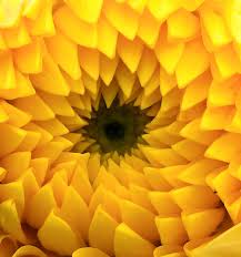
I think that this is my favourite image for form as it shows a natural example. I really like the darker background in the photo as it helps to make the leaves in the for-ground stand out more and helps the element of form be portrayed more easily. When I took this image, I had the camera on macro mode which allowed me to get closer up and still get a lot of detail in my image. I also like the colours in this image as they are autumn colours and give the photograph a more creative feel.

I then tried my image in black and white. I like the image in these colours as I think it gives a creative feel. I thought that it would look better in black and white as I thought it would present form better. However, I actually prefer the photo in its original colours as I think it is more eye-catching.

I also really like this photo of the feather that I edited on photoshop. I think it presents form well as it shows the structure of the feather. To create this image, I used photoshop to select and manipulate selected colours. To do this, I used the 'quick selection tool' and selected the area I wanted to change. I then went to 'select' and then 'inverse' so that I cold make the background black and white. I could then change my image's colour by selecting 'hue and saturation'. 

This was one of my unsuccessful images of the shoot. The image is too dull and it is not clear what topic the photo is trying to portray. I think that it is possible that people may mistake the topic as being 'line' as the photograph presents line in many different ways but I do not feel that the intention of 'form' is clear in the image. In addition, I feel that the photograph is boring and lacks imagination and creativity and for this reason, does not attract the viewers eye.


Idea Development

If I were to shoot for the topic of 'form' again, I would perhaps try to base my shoot on natural examples. To do this I would try to shoot leaves, tree trunks, flowers and even fruits and vegetables. I think this would provide me with an interesting and imaginative focus for my shoot. When I had completed my shoot, I would also experiment with my images on photoshop and would assess what they looked like in black and white with the hope that the contours in the image would appear more obvious. Below shows some images which, if I were to shoot for 'form' again, I would try to base my work on.


Form - Straight Images - Best 5

Form - Straight Images


I really like this image as I think it presents two types of form. Firstly, it shows form by means of the main subject of the image which is the feather. Secondly, the wood that the feather is sitting on shows form due to the detail and indentations that can be seen. To capture this image, I had to use macro mode.

I think that this image has potential to show form well. However, to do this, I think it would need to be put in black and white in order to focus the viewers eye to the aspect of form rather than the other element of colour. I also think that if I were to reshoot this image, I would try to shoot it on a slightly duller day or be sure to turn down the exposure on my camera as I feel the image has come out with a lot of light areas with not many darker areas.

I really like this image as I feel it shows form very well. Again, I feel it would look better if it were in black and white as it would allow the contours in the image to be more prominent and eye-catching. However, if it were in black and white, I feel it would present form well due to the varying textures and also the pronounced embossed and raised areas.

I really like this image as I think it presents an example of natural form. I really like the darker background in this image as it helps to make the leaves stand out more and helps the element of form be presented easier in the photograph. To achieve this image, I had to put the camera into macro mode in order to get close enough and get enough detail in my image.

I think this image does a good job of presenting form by means of the building. However, despite the fact that the image presents the theme well, I feel that the photo is slightly boring and fails to grab the viewers attention. For this reason, I think that it would be beneficial to try the image in black and white to see if it helps to attract peoples attention and therefore focus the viewers on the formal element of form.

Form Contact Sheet

Form Contact Sheet


Form Image Bank

Form Image Bank


This image was taken by photographer Imogen Cunningham who focuses on the illusion of form in 2D images. She photographs in black and white which adds to the depth and tone in the image which contribute to the formal element of form. I really like how this image shows a natural example of form as it adds interest to the image.

I really like this image as it presents form very well. I really like how it shows both natural and manmade examples of form. I also really like the element of perspective as the chain links get smaller towards the bottom of the image. I think the fact that the image is in black and white, helps the viewer to focus on form rather than any other aspects of the image.

I think that the bold and striking colours in this image present form really well. I also like the use of light and shade as it draws the eye to the shell which is the main focus point in the photo. I think this image would also look very effective in black and white as it would make the theme of form even clearer. I also think the stripes on the shell would look very effective in black and white.

I really like how this image presents form in a very simple way. The chess pieces almost seem to be silhouettes which I think shows the theme of form very well as although they do not appear three-dimensional, the viewer knows that they are. I also like the element of reflection which is presented in the image by the seemingly artificial lights being reflected on the table.

This is one of my favourite images as it presents two types of form. The most obvious is in the form of the shell which catches your eye as it is the darker area of the image and is easily recognisable as being 3D. The other example of form in the image is the wood that the shell is resting on. Overall, I think that this image portrays the formal element of form very well.

This image is successful in the presentation of form as it shows a very interesting example of form. The use of the black and white filter helps with this presentation as it makes the main example of form in the image more obvious and eye-catching.

Define - Form

Form Definition

Form - Form is a three dimensional shape, such as sphere or cone. Sculptures and 3D designs are about creating forms.

In 2D artworks, tone and perspective can be used to create the illusion of form.

My interpretation of form involves the ideas of shape, perspective and tone to make an image appear more three-dimensional.


Four Annotated Images

This image presents the topic of form very well as it presents both the form of the snails shell, as well as the form that is present in the wood. The fact that this image is in black and white helps the audience to focus on the element of form without being distracted by the colours in the image.

This image is likely to have been shot in a studio. It presents form very clearly due to the shadows which are created. This helps to reinforce the element of form which is present in the bananas. I also like the composition of the image as makes the object the only point in the image as which to focus on.

I really like the element of colour which is present in this image. In this specific image, it helps to reinforce the topic of form as it allows the plant to be suggested as the object which has form. I think that it stands out and is eye-catching due to the very dark background which surrounds the vibrant plant.

This image presents form well due to the clearly defined pen which is in the image. I think that the black and white filter on the image allows the pen to stand out more which therefore makes the pen the main focus point which reinforces the topic of form.


Thursday 24 September 2015

Pattern - Work Diary

Pattern - Work Diary

Evaluation

In Thursday's photography session, we were asked to go out and shoot for the topic of 'pattern'. At the start of the session, I thought that pattern was going to be easy to shoot for, but as the session progressed, I found that I was mistaken and pattern was actually, in my opinion, the most difficult topic so far. However, by the end of the session I was finding the task much easier and had taken a number of shots which I felt presented pattern. Below are two images which I captured during Thursday's session.

This was my favourite image that I captured for pattern as it presents a natural and less obvious form of pattern. I really like how the little flowers are repeated many times but are not in a linear structure. The fact that the pattern is confined to the circular structure gives an added interest to the image. I also really like the colours of the image as the lighter green helps to focus the viewers eye to the pattern and also makes the image more appealing to the eye. If I were to adapt this image on photoshop, I would try putting the image in black and white as I feel it would compliment the pattern and help the viewer to focus on the element of pattern in the image.

I have experimented with my favourite image on photoshop and have made my image black and white. I think it looks very effective and I think that it shows the theme of pattern much better than the colour version does.

This is another image that I took during Thursday's session. Despite the fact I think it shows pattern well due to the repeated square design, I really feel that this picture lacks imagination and interest. The dull grey and monotone colours make the image have a very boring feel and does not make it either appealing or inspiring.

Idea Development

If I had to reshoot for pattern, I don't think it would be as daunting the second time round, so I would feel more confident to experiment with different and more abstract ideas. Next time, I would focus on shooting patterns in clothes and would also focus on natural forms of pattern such as plants, flowers and fruits. I think these would all make exciting and effective images which would be eye catching to a viewer. In addition, if I were to reshoot, I would focus on taking close ups rather than shooting the full object as I think with this topic, the close ups allow the focus to be on the patterns rather than the objects themselves. Again, if I were to reshoot, I would try to go out on a bright day in order to get vibrant colours in my images which would therefore make them more appealing. By going out on a sunny day, it may also be possible to capture images of patterns made by shadows which I think would look partially effective. Below show some images that I would use next time for inspiration.


Pattern - Straight Images - Best 5

Pattern - Straight Images

I think this image presents pattern well as it presents the idea of the repeated blocks. The colours of black and yellow on the blocks helps the viewer to notice the pattern as it is quite clear and obviously repeated and is therefore eye-catching. I also like how the pattern has a slight curve in it. From my perspective when I was shooting, this was ideal as it allowed a large number of the blocks to be seen in the shot.

I then edited the above image by increasing the saturation and also altering the curves. I think that this image looks effective in this way.  I also like this image as it demonstrates a shallow depth of field as only one area at the front of the image is in focus. 

This is one of my favourite images as it presents a natural and less obvious form of pattern. I really like how the little flowers are repeated many times but are not in a linear structure. The fact that the pattern is confined to the circular structure gives an added interest to the image.

I feel is portrays pattern well and I like how the lines keep changing direction. This also gives the feel of perspective as the lines converge into each other at points. However, I feel the image lacks creativity and therefore does not make it very eye catching.

I then edited the image and used a black and white filter. I also adapted the curves in order to make the image brighter and also to help it to have more contrast. In my opinion, the image looks more effective after the edit.

This image shows a wicker basket. I really like the pattern shown in the image as it is interesting and catches your eye. I also like how the left side of the image is quite bright and then it gets darker on the other side of the image as the pattern changes direction. In addition to pattern, the image shows texture well as you can see the detail of the material which makes up the pattern very clearly.

I like this image as it shows a natural pattern in the form of a leaf. I like how you are able to see all the lines on the leafs surface as I think it makes the image attractive and appealing to the eye. However, if I were to improve the image, I would take more of a close up of the leafs surface to include the more intricate details and also take the shot on a bright day so that the colours were more vibrant.

Pattern Contact Sheet

Pattern Contact Sheet


Pattern Image Bank

Pattern Image Bank

I really like this image as it shows pattern very well by taking up the entire frame. I also really like how the green is between the tiles as it makes the image more appealing and attracts the eye to the centre of the image.

I really like this image as it shows a circular type of pattern. I also like this image as it shows a natural form of pattern. The colour makes the image very appealing and therefore draws the viewers eye to the photograph. However, the trouble with the vibrant colours is the fact that viewers eyes may be more attracted by the colour than the actual pattern.

I like this image as it shows two types of pattern both with the spots on the bugs and the bugs themselves make a pattern on the bark. In addition to the pattern, I like the bright red on the dull background as it catches your eye.

I like this image as the patterns are very defined and obvious. I also like how the image is in black and white so it focuses the viewer to the pattern rather than attracting them with the aspect of colour. In addition, I like how the other formal element of line is in the image.

On the surface, I do not think that this image is very effective. However, when you take a closer look at the shadows in the image, the theme of pattern becomes clear. I really like how the shadows overlap as this creates a more obvious pattern formation in the photograph.

This is one of my favourite images for pattern. I really like how the pattern is in the foreground and the background is a landscape. I especially like how the black pattern compliments the vibrant background as it makes the photograph more interesting and eye catching.