Sunday 31 January 2016

Fourth Plinth - Composite Images - Fairy

Fourth Plinth - Composite Images - Fairy

For this shoot, I decided to use some of my previous images which I captured for the landscapes topic and add in an object which in my case was a little angel keyring which I positioned in a range of settings using photoshop. I used the burn tool to make the pasted image look as though it belonged in the setting and also to create shadows within the image in order to make it look slightly more realistic. I like how the below images that I have created can be thought have a link to the Cottingley Fairies. This is an idea I would like to use as inspiration later in the topic.


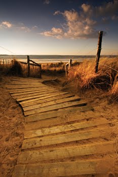
This is one of my favourite images which I have created. I like how the two images were taken at the same angle which makes the two fit together much better. I also like the fact that the fairy looks surreal, but still realistic as the positioning of the fairy has helped to make the image look effective.


I like this image as at first glance, the image is normal but when you look closer, you can see the fairy on the bottom left hand corner. I like how the surreal element of the image is less obvious and is more hidden. I like this a sit makes the image more mysterious and interesting. I used the burn tool to make the fairy look as though it were perched on the little branch. 

I like this image as it is very interesting and the colours are very bold. I like the way that the fairy appears to be perching on the leaves and looking out into the distance. I feel that the image shows thought which is portrayed through the fairy looking out and by the viewer not being able to see its face. I also like how you are able to see the fairy's wings in this image as it   presents the element of fantasy which I have tried to portray in the images.  I also used the burn tool in this image to show the shadow on the leaves which makes the idea of the fairy sitting on the leaf look more realistic. 


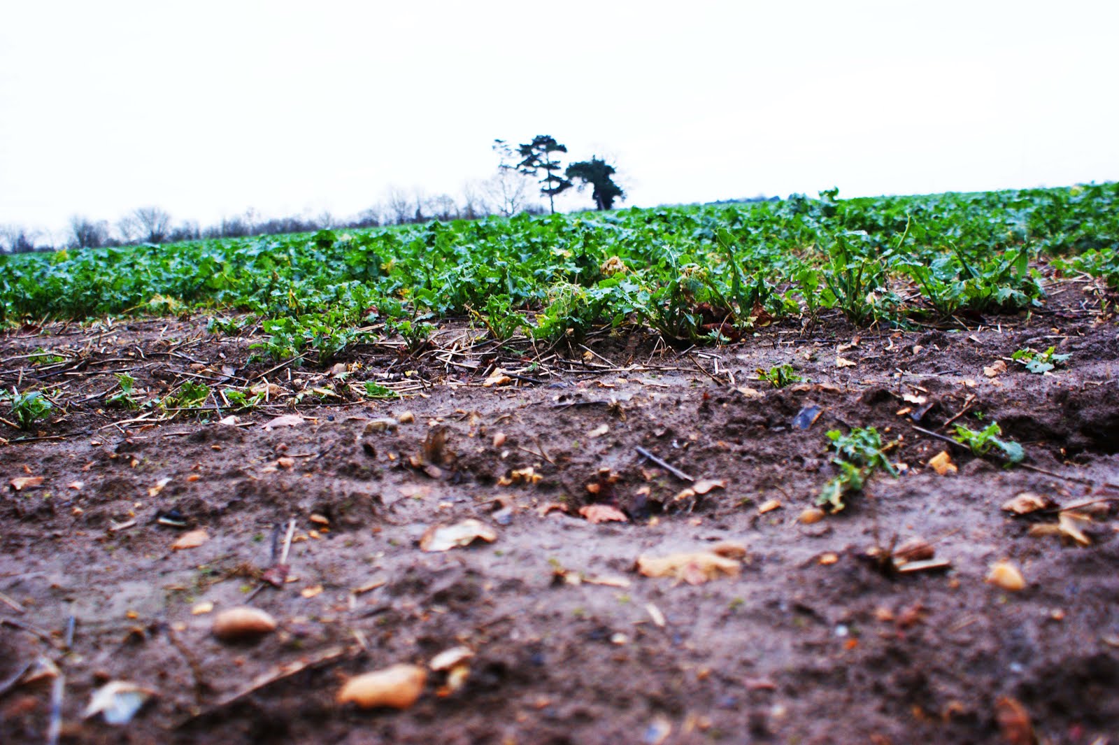
I also like this image which I created using photoshop as I like the less obvious element of the fairy in the photograph. I like how the fairy is positioned in the top left hand corner as it takes the viewer a little while to find the surreal element of the image. I chose to position the fairy so it appeared to be sitting on  one of the trees branches.

Evaluation

Overall, I am very pleased with my first attempt at final outcomes for composite images. I like the element of fantasy that my chosen object has bought to the images. For the images which I created, I used photographs which I previously took for the topic of landscapes and added in the images of the fairy, which I took in the studio, to the landscape setting. To begin with, I found creating the composite images using photoshop quite challenging but after a while, found it to be second nature and also found that I could do it quite easily. While creating my images, I also perfected the art of using the burn tool in order to make the fairy appear as though it belonged in the settings which I chose. I like how the four images which I have created all link with each other as this makes them interesting. I hope to develop this idea further in the future and will use the idea from the 'Cottingley Fairies' as inspiration. Overall, I am really pleased with my first outcomes for the topic of the fourth plinth.  

Fourth Plinth - Artist Research

Fourth Plinth - Artist Research

Cedric Delsaux

Delsaux is a French photographer who captures series of surrealist and manipulated images. His most surreal series is one called 'Dark Lens' where he added Star Wars figures into images. Below shows some images from his 'Dark Lens' series.  

I like this image as it is very clear and the figure looks as though it belongs, though the viewer knows it really does not. I like that the two images combine very well due to their similar colour schemes and the well positioned figure.

I really like this image as it clearly combines an unrealistic image onto a real setting. I like the way the Star Wars figure is slightly hidden by the fog as this makes the image less obvious and lets the viewer find the figure of their own accord. 

I like this image as the colour schemes of the two combined images match very well which therefore leads to the two images complimenting each other very well. I also think that the scaling and shooting angles of this image works very well. 

I also like this image as it is quite mysterious and also looks very realistic, despite the viewer knowing it is not actually real. I also think that the lighting works very well within the image as it helps to draw the audiences eye to the star wars figure and also makes it look as though the figure is really there. 

Jeff Koons

Jeff Koons was born in 1955 and is an American Artist known for his production of banal objects such as baloon animals. Koons was born in Pennsylvania and studied at the Maryland Institute College of art in Baltimore and the School of Art Institute of Chicago. He lives and works in New York City. He had his first solo exhibition in 1980 and nowadays, his work is shown in many galleries around the world. Koons is renowned for his public sculptures, and example being his monumental floral sculpture 'Puppy' which is shown at Rockefeller Center and is permanently installed at the Guggenheim Bilbao. In addition, Koons has received numerous awards and honours in recognition of his cultural achievements. During his career, he has created numerous series with an example being the Banality series. He is not actually a photographer and is in fact, considered as an artist. Koons uses his balloon animals to create surreal images which would not actually occur in real life. 

I really like the idea of the balloons as they look incredibly surreal and as a result look effective. I like this image as it shows the grand scale of the balloons by placing them in an area in which they can be compared to the people walking past.

I really like this image and think that it looks very effective as it can be compared to the people in the background. I think this image looks more effective due to the setting it is placed in as the background appears interesting and vibrant. I also like how you are able to see reflection in the balloon.

I like this image as the background is very interesting and it also adds interest to the image. I think that the artist is trying to convey the idea of a family dog outside the house within this image. I like this as an idea but the image u made interesting by the enlarged balloon dog. 

I like this image as again, it has an interesting background. I like how with this image, the shooting angle of the balloon matches that of the background. This is an essential part of the shooting process as it helps to achieve successful and effective images.

The Fourth Plinth

Fourth Plinth Ideas


To get some inspiration for the topic. We visited London and I shot around Trafalgar square where the real fourth plinth is. Below shows an image which I took that shows what the fourth plinth featured when I was up in London.

Friday 29 January 2016

Artist Research - Julia Margaret Cameron

Artist Research - Julia Margaret Cameron - Influence and Intimacy Exhibition

During Thursday's session, we went up to London to go to some photography exhibitions which were on display in the Science Museum in South Kensington. One of the photographers who had an exhibition there was Julia Margaret Cameron. She was born in 1815 in India and was a English photographer who was well known at the time for her portraits of celebrities. The exhibition centred around the Herschel Album (1864) which was a sequence of 94 images which she considered to be her best work to date. The images consisted of expressive portraits of influential friends and family members.

Three of Julia Margaret Cameron's Images from the Exhibition -

Below are three images which were featured in the exhibition.


I liked this image from the exhibition as I thought it showed a different and original element of portraiture as I had never, until now, thought of getting an individual to look down when photographing them for portraiture. I feel that this shows a different perspective of the face and in this case looks extremely effective and thought provoking. I like the image as we are only able to see the mans face and therefore can make no assumptions of his lifestyle through looking at his surroundings or clothing. I think that this makes the audience analyse the man's feelings more deeply as there are no clues about his lifestyle or mood in the surroundings and therefore one has to look at his facial expressions. I like this image and thought it was a very effective portrait.


This image was also one which caught my eye in the exhibition. Although this image is not usually the type of photography which I like, I think it is very effective and makes you want to know or find out about the individuals lifestyle.  I like the way you are unable to see the girls setting as this makes the audience have to make an assumption about her lifestyle and feelings based on just the facial expressions and clothing. In this way, I think the image is very effective at making the audience think more carefully about the images.


This photograph was also part of the Julia Margaret Cameron exhibition. This was another of the images which caught my eye as I feel that is thought provoking as it makes you wonder what the woman in the image is both thinking and feeling. I like the composition of the image by means of the individual not looking directly into the camera and instead looking towards the bottom left corner. This ambiguous direction of the eyes makes the viewer wonder what she is looking at and as a result, start to wonder about what she is feeling and thinking about. When I examine the image, I believe that the woman is possibly in thought and is thinking about perhaps something tragic or upsetting due to the fact that she has such a solemn look on her face. Like the other images, I also like how you are unable to see the background as this forces the audience to consider deeper analysis of the individual by taking into account her clothing as well as her facial expressions and what you can see as her body language.

Evaluation

Overall, I think that Julia Margaret Cameron's images are effective and thought provoking but do not feel they are very inspirational for me personally and find them to all be quite similar to each other which for me, makes them become boring. However, I do like the natural positioning of the subjects in the photographs and also like the brown colour schemes as this would help to make some of my own images appear old like her images.

Artist Research - Alec Soth


Artist Research - Alec Soth - Gathered Leaves Exhibition

On our Thursday session, we went up to London to go to an Alec Soth (born 1969) exhibition at the Science Museum in South Kensington. The exhibition showed four of his major works - Sleeping by the Missisippi (2004), Niagara (2006), Broken Manual (2010) and Songbook (2014).
Soth is a fine artist, photojournalist, blogger and self-publisher who explores many different forms of photography. The exhibition attempted to reflect the evolution of Soth's work over the years and many of his photographs reflect the American way of life. 

Three of Alec Soth's Images from the Exhibition -

Below are three images featured in the exhibition.


This image is from Soth's series called Broken Manual. Broken Manual is a series in which Soth explores the desire to run away. Soth became interested in the world of those who are detached from civilisation and soon discovered communications with hermits, monks and survivalists. Soth chose to photograph many of these individuals in their solitude and in many of his images, creates an unnerving feeling which helps to emphasise the separation between us and them. I liked this image when I was looking round at the exhibition as it presents exactly what the series is trying to portray. I like how the individual is far away as it means that the audience cannot source his identity which makes the whole photograph have an unnerving and slightly ambiguous feel to it. I like how the man appears very insignificant in size in comparison to the trees as this helps to present the connection between him and the nature. I like the colours within the image as again, they help to convey an unnerving, mysterious feel and as a result, present the difference between us and the people in the images. I also like the way that the image and the distance between us and the subject makes the audience wonder what has happened to the individual in the image to have made them have that chosen life of solitude. 


This image is from one of Soth's series called 'Niagara' and the image is called 'Misty 2005'. In the Niagara series, Soth explored the area around Niagara falls which has long been associated with love. The series is formed by images of the area, the falls, wedding venues and portraits. With his series, he attempted to juxtapose the idea of the almighty falls with the idea of fragile love. Although I do not feel this image is the best at portraying the overall intention of the series, it is still part of it, and was the one in which I found most appealing and striking during the exhibition. I like the simplicity of the image and especially like how the dark background draws the eye to the individual. The eye is drawn even more to the individual as she appears to be wearing a bright blue swimming cap. This then makes the audience puzzle about how the individual is feeling as she appears very solemn and gloomy in the photograph. When looking at the image at the exhibition, I wondered what it had to do with the idea of fragile love but as you think about the image and meaning more, I have come to wonder if the whole reason for the subject looking so solemn is due to perhaps 'failed love'.


This image is taken from Soth's 'Sleeping by the Mississippi' series and the image is known as 'Peter's Houseboat'. This series was based not far from Soth's birth place and within it, Soth travels a 2000mile course southwards towards the Gulf of Mexico, taking photographs at each location on his journey. The series includes photographs of the boyhood homes of the likes of Johnny Cash and Charles Lindbergh. The series attempts to capture a sense of imagination and dreams, something which Soth managed to capture in many of the photographs in the series. This was the image from the series which caught my eye in the exhibition and although simplistic in comparison to some of the others, I thought it was very effective and captured the mood and ideas of the series very well. Firstly, I like the composition of the photograph by means of the fact that the house is positioned to the right hand side of the image which allows a very blank space on the opposite side. I think this looks effective and in my opinion, the white of the snow captures the sense of imagination which Soth was attempting to portray in the images in the series. I feel the image may be trying to suggest the dreams of the person living in the house as well as capturing the idealistic and striking area around it. 

Evaluation

Overall, I like the images which were featured in Alec Soth's exhibition called 'Gathered Leaves'. I think they are all effective and each show a different and unique story. I also like how each of the images are thought provoking and each present a different type of lifestyle or show a different concept or idea. I found the photographs in the exhibition very inspirational and will use them to inspire my own photography. I especially liked Soth's landscape photos as well as portraits as I like both the compositions of them and the stories which they suggest and present.

Thursday 21 January 2016

Connecting Essay 5

Connecting Essay 5 - Landscapes

Helen Dixon's Photograph -

This image was taken by Helen Dixon who is a landscape photographer. This image captures autumn colours as well as showing trees and their form. The image can be thought to present the formal element of form and colour due to the presence of the trees as well as the autumn colours which cover the ground. I like how the use of colour emphasises the seasons and also like how the image is bright and well lit. in addition to this, I think that the way that the leaves in the foreground are not in focus helps to create a chaotic feel to the image and this could again, could be thought to portray the season.

My Photograph -

These are two images which I captured when shooting for the topic of landscape. I like both of the images as I feel they can both be used to present landscapes and seasons. I like how the first image shows the form and shape of the trees as well as the colours which are shown in their structures. I like the second image as I feel it has been captured from an original angle which adds interest to the image and I also like how the image shows bold autumn colours in the form of the leaves. I edited both the images on photoshop and increased the saturation as well as adapting the curves. 

 The Connection -

Although neither of my photographs look exactly like the photography which was captured by the photographer, I chose the two as they both show an element of the image. Firstly, the first image is similar to the photographers image as they both show the trees and their structures and shapes. The difference is however, that the photographers image was taken in the autumn so the tree has leaves whereas mine was taken during winter so as a result, does not have leaves. I also like how my first image shows pattern in the form of the trees which are in a line. I think that my second image also relates to the photographers one as the colours are very similar and both demonstrate the vibrant autumn colours in the form of the leaves which are on the ground. In this way, both the images could be considered to show the formal element of colour as well as showing landscapes. I also like the similarity which is that you are able to see the branches of the trees in both photographs. In my image, in order to achieve the bold and vibrant colours, I used photoshop and adapted the curves and saturation and this made my image look more similar to that of Helen Dixon. 

London Landscapes - Work Diary

London Landscapes - Work Diary

Evaluation

Overall, I feel the London shoot went very well and feel that I captured a successful series of images. I like how the images capture iconic areas of London and therefore help the audience to connect more to the images. I enjoyed exploring the topic of landscapes and in my first series, I took rural landscape shots but for this, I took urban landscapes in the form of London. During the trip, I enjoyed shooting for the topic but as it got dark found myself struggling. However, once I had figured out the correct camera settings, my photographs began to come out well again. I found that at night, the correct camera settings were having the f/stop at 5.6 and either putting my ISO to 400 or 600, or alternatively, putting the camera on night mode. I found that I could create more interest in the images by shooting from alternative angles and also by shooting both landscape and portrait. Below shows some images from the London shoot.


This was one of my favourite images from the London shoot. I like the colours in this image and especially like how the road has an orange tint which reflects on the interestingly shaped building. I also like how the image presents the formal element of line by means of the road. I also like how there are no cars on the road which gives the audience the feeling of dissertation which can contribute to the image giving off an uneasy feeling. I captured this image on the f/stop of 5.6 and had my camera on auto focus. 

This is one of my least favourite images from the shoot. The image was taken when it was just starting to get dark and also when I hadn't adapted my camera settings yet so this therefore makes the image appear very dark and gloomy. Also the image composition is not very good as you can see a person's face on the left hand side of the image. Also, the image is slightly out of focus and in addition to this, the cars headlights are slightly overpowering in the image. For this reason, I do not like the image and feel that it is a boring and therefore not a successful image.

Idea Development

If I were to go up to London again and shoot landscapes, I would take a tripod as this could help me get more images in focus, especially when it started to get dark. In addition to this, I would go to London for a whole day so in this way I would not be limited and restricted by the fading light. I would also visit more areas in London in order to get a wider range of images in different locations which I feel would create a more broad outlook on London. If I were to shoot again and at night, I would use Rut Blees Luxemburg's night photography as inspiration. Below shows some images which I would use if I were to shoot for the topic of Landscapes in London again.


Wednesday 20 January 2016

London Landscapes - Straight Images

London Landscapes - Straight Images

I captured these images during our trip up to London. They were all taken in the area around Trafalgar Square and Embankment. I took most of the images on f/stop 5.6 and varied between manual focus and auto focus with my ISO set at 200. However, when it started to get dark, I increased my ISO to 400 or 600 and eventually put my camera onto night mode. 

This image was taken near Trafalgar Square. I like the image as it presents many of the formal elements. It shows line in the form of the pavement as well as the buildings and road lines. I like how the pavement is a leading line which draws the eye up towards the building in the centre of the background. I also like how interest has been added to the image by the pedestrian crossing buttons. I edited the image on photoshop and adapted the curves in order to lighten the image and also increased the saturation to make the image more striking.

I like this image as I feel it presents an iconic feature of London in the form of the London eye. I like how it is in the background and lit up as this makes the background more interesting and also like how the road in the foreground has bold white arrows as this makes the image more eye-catching and also presents the formal element of lines. I also edited this image using photoshop by adapting the curves and levels.

I like this image as it shows a wide area of Trafalgar Square. I like the image as you can clearly determine where it was captured. I like the brightness of the image as it helps to make the image more striking. I also edited the image on photoshop and adapted the curves and also increased the saturation to make the image bolder and more eye-catching. 

I really like this image as it has been taken from an alternative and interesting angle. I shot it in Trafalgar Square and like the way that the image shows both the fountains as well as the steps and building in the background. I like the way that the image shows depth by the side of the fountain is not in focus whereas the water and background is. I achieved this by having my camera on manual focus with the f/stop of 5.6. Although I really like the image, I do not like how the image shows the red display in the background as this could be seen to draw the viewers eye away from the main focuses of the image which are the fountains and the building.

I also really like this image as it looks as though it has been inspired by Rut Blees Luxemburg who mainly photographs at night. When I fist took the image, I did not like how there are people in the foreground who are not in focus. However, the more I see the image, the more I like it as it could be thought to tell a story in this way. I also like how the people help to create a sense of scale of the building. 

I really like this image as the building is very interesting and I also like the way that the road is empty as this creates a feeling of desertion which to begin with, can make the audience feel uneasy. I like the way the image shows the formal element of line in the form of the road but also shows shape in the form of the interesting building. I also like how the road appears to be slightly lit up and as a result has an orange tint to it whereas the building is naturally lit so has kept its original colour. 

Landscapes - London - Contact Sheet

Landscapes - London - Contact Sheet

Tuesday 19 January 2016

Landscapes - Work Diary

Landscapes - Work Diary

Evaluation

During the past few sessions, we were given the task of shooting for the topic of landscapes. At first, I thought that this was going to be a boring topic. However, as the topic progressed, I found that it involved more than I had first thought. I do not feel that my initial shoot was very successful as the day was very windy and this therefore made my images slightly blurry. Also, I found that I struggled to shoot a 'landscape' in Harlow. However, I thought that my second shoot was more successful and thought that I managed to explore the topic further by experimenting with different shooting angles and camera settings in order to capture more effective and interesting images. I also liked that for the second shoot, I was able to capture my images in a setting which I found inspiring and interesting. Below shows some images which I captured during my shoots.


This is one of my favourite images from the shoots. I like the angle at which it was shot at as I feel it is interesting and different. I edited the image on photoshop and increased the contrast and saturation as well as adapting the curves to make the image appear brighter and therefore more effective.


I like this image as it has an additional element as well as the landscape. In my opinion, this helps to make the image more interesting and effective. I also edited the curves of this image to make it brighter which helps to make the image more striking and eye-catching.

 
This is my least favourite image from the shoot as I feel that it is very dark and does not really show a true landscape. I don't mind the silhouette effect but do not feel that the image is effective as it is also quite boring.

Idea Development

If I were to go out and shoot for the topic of landscape again, I would try to go out and shoot on a day which had more interesting weather, whether it be snow or sun. I think this would assist me in adding interest to my images. I would also be interested in attempting to capture a series of images which all related to each other and also perhaps creating a series of images which were more saturated and bright. For this, I would use the landscape photographer Helen Dixon as inspiration as I really like her images and the style in which she captures them with. Below shows some of her images which I would use as inspiration.


Landscapes - Straight Images

Landscapes - Straight Images


I like this image as it is quite original and effective. I like the sense of perspective in the image which is shown by the trees and the differing scales. I edited the image on photoshop and increased the saturation and also adapted the curves.


I like this image as it shows landscape but in an original way with the added feature of the plants in the foreground. I also edited this image by increasing the contrast and adapting the curves to make the image brighter and therefore more effective.


I like this image as it includes a leading line in the form of the ditch. I like the bright green colours in the image as it makes it appear bold and striking. I also like how the sky appears white as it makes the trees in the background stand out which therefore shows the horizon. 


I really like this image as it also includes leading lines. I like the green colours in the image and also like how the image appears mysterious and interesting.


I like this image as it captures a landscape but it is shot at an original and different angle. I like how the landscape is taken from a different perspective as it creates an unusual outlook on what would usually be a rather boring landscape.


I like this image due to the leading lines which are shown by the trees. This makes the image more effective. I edited this image on photoshop and increased the contrast and saturation and also adapted the curves of the image in order to increase the brightness of the image.


I really like this image due to the low down shooting angle and also the colours which are in the image. These colours have been made more prominent by editing the image on photoshop. They were made bolder and more striking by increasing the contrast and saturation.