Tuesday, 17 November 2015

Joiners - Straight Images

Joiners - Straight Images

This is my first attempt at a joiner. I captured the images for this in the studio and like the lighting in the images as they help the images to appear clear and help the colours be quite bright. For my first attempt, I think that the joiner is quite successful and I like the distorted element of the image as it helps to create a more surreal feeling. 

I experimented further with the photo joiners in photoshop and adapted the background colours. I thought that black would have be a good colour to experiment with due to the colour of the subjects trousers. However, I prefer the original image.


This was another attempt at a joiner. I took the images in the studio and this time, only used 5 layers. In my opinion, the image looks a bit strange, but I think this is because I am not used to looking at photographs in this way. I like the distorted element of the joiner as I think that it makes the image more eye-catching. In someways, I quite like the fact that the image at the bottom goes off the white background as it creates an elongated feel. Overall, I am quite pleased with the outcome considering it was my second attempt at creating a joiner.

I also experimented with this image and made the background the same colour as the subjects clothing. I think that this image looks effective as the background compliments the individuals clothing.


This is a more simple example of a joiner as it only includes three layers. However, I made the image more effective by using rotations and also using a black and white filter. This filter helps the viewer to distinguish between the images due to the different tones that are shown. I really like this image and also created another version of it where the photographs were angled slightly differently.

For this edit, I also used the curves tool to edit the image further. This helped to make the building darker which helped with the boldness and therefore leads to the eye being more drawn towards the building as the main focus point. 

This image shows more of a landscape which was created using joiners. Again, the joiner is more simplistic and only uses three layers but I still think it looks quite effective. With this joiner, I also used slight rotations on some of the images to make the overall image more interesting and eye-catching. 
This image also shows a landscape scene. This joiner is formed from four layers and does not include any rotated images. This more uniform effect makes the image appear more organised and therefore helps to make it more aesthetically pleasing. Although I think the image looks effective, I do not think it is as interesting and striking as my other joiners that I have made. 


This joiner is made of approximately 5 layers. I think the image is effective as it combines a good amount of images and uses them at different angles within the image to give the most effective appearance. I think the image is very striking but do not like the great variation in colour between the images. This variation is especially noticeable on the bottom two images as the one at the very bottom is  very bright, while the one above is quite noticeably darker. 

Due to the variations in colouring, I decided to edit the image using a black and white filter to reduce the effect of the different colours. I think that this image looks quite effective and I like the way that the branches of the trees stand out and are bold against the light background.

Joiners - Image Bank

Joiners - Image Bank

I really like this example of a joiner as it is different to some of the others I have seen due to the spaces between some of the images. This helps to make the image more effective and eye-catching. I also like the colour theme in the image as the theme of black and white makes the image bolder and more striking. This image is by David Hockney. 


This joiner seems to be more complex due to the large amount of images that are included in the composition. I really like the idea of this increased amount of images and think that this helps to add effect to the overall photograph.


This image is also very effective as it makes the image more obviously distorted by having uneven spaces around the images. I also like the obvious overlapping effect which is present in the image as it adds effect and depth to the image. 


I really like this image and think that it looks very effective. From a distance, it appears to be a full image but when you look closer, you can see that the image is made up of multiple pictures. I like the way that in this image, the photographs are only at slight angles as I think this more uniform effect helps to make the image more effective. 

This is an example of a portrait joiner. I really like this joiner as I feel that the different angles that the photos are taken makes the overall composition interesting and therefore helps to draw the audiences eye more to the image. 


I really like this example of a portrait joiner by David Hockney who was the artist that introduced the idea of joiners. I really like the distorted element of the image and like the way that the photographs are taken from different angles as I think that this adds more interest to the image and also helps to make it more striking. 

Define - Joiners

Define - Joiners

Joiners - A technique in which one picture is assembled from several overlapping images. This can be done manually with prints or by using digital image editing software, such as photoshop.


Four Annotated Images

This image is quite a complex joiner as it consists of many images which are layered together. However, for this reason, the image is very effective and is also very interesting and eye-catching.

This is a very interesting example of a joiner by David Hockney. I really like the distorted perspective that the edit has produced. It is very effective and has transformed an quite boring object to photograph into a very interesting image.

This is a more simplistic example of a joiner. In this example, I like how the images are all arranged at the same angle which allows the audience to see variation in colours in the different images. This looks especially effective on the black background. 

I like this image as it is similar to the one above. I also like how the colours in the images are varied which helps to show the different layers within the image.


Wednesday, 11 November 2015

Depth - Work Diary

Depth - Work Diary

Evaluation

In Tuesday's session, we were given the task of shooting for the topic of depth. To do this, we had to use the cameras on manual mode and manipulated the f/stop values on the cameras whilst we were out shooting to ensure our images turned out the way we wanted them to be. Initially, I found using the camera on manual mode quite challenging, but after a while, got the hang of it and actually found manual mode to be better than auto focus mode. During the shoot, I found myself photographing a lot of natural things as I found that these created the best images to portray depth. Overall, I found that shooting for depth was enjoyable and that it allowed me to be creative. Also, having the camera on manual mode, allowed me to focus on specific areas of the shots. I also took some photographs in the studio using people. I really like the outcome as I feel that the images present a different form of depth. In addition to the work in the studio, we also explored the presence of depth by means of structures such as sculptures. I did not really like these images as I thought they were quite boring and were not eye-catching at all. Below shows some examples of the images that I captured during the session.

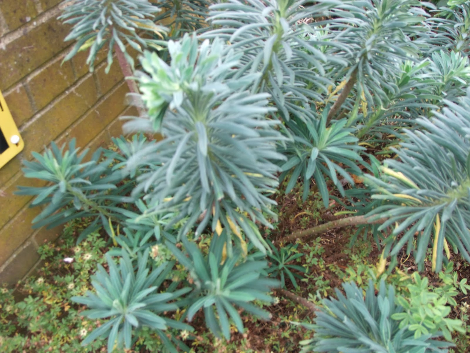
This is one of my favourite images as it shows depth very well. It shows narrow depth of field and I also like the way that it shows an example of point of focus. In my opinion, the image is quite interesting due to the shapes which are present in the image as well as the quite striking colours.

This is another of my favourite images and also shows a narrow depth of field. I really like this image as it would normally be considered to be boring, but with the added element of depth, the image has become more interesting. I really like how you are able to see the detail which is on the wire as this makes the image more eye-catching and interesting to the audience. 

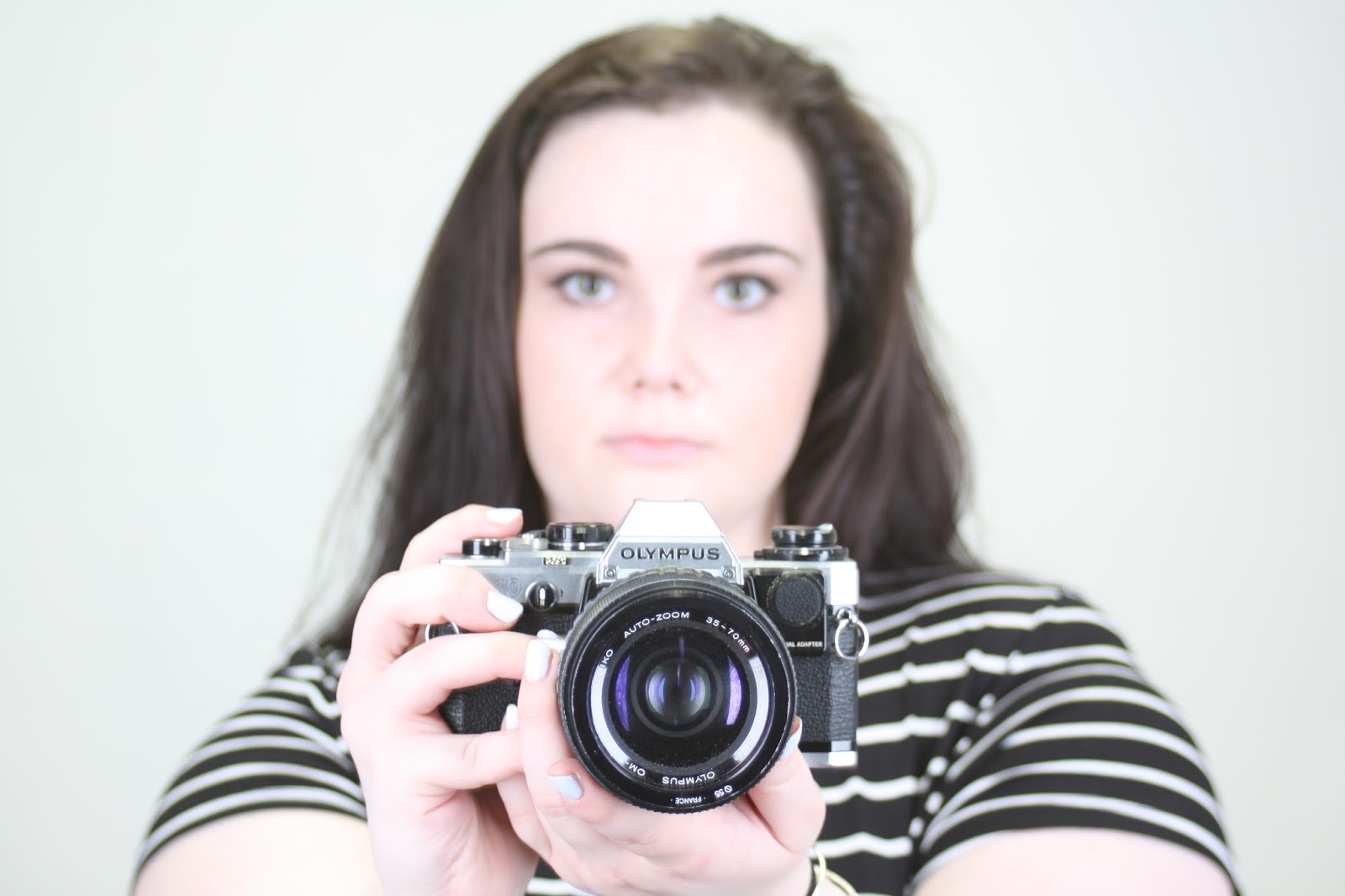
This is my favourite image that I captured in the studio. For this image, I used the f/stop value of 5.6 in order to achieve the narrow depth of field which is present in the image. 

This image is my least favourite from my shoot. I took this image relatively early on in the shoot when I was struggling with using the camera on manual mode. This image does not show depth and does not demonstrate either a narrow or wide depth of field. For this reason, I do not feel that this is a successful image.


Idea Development

If I were to shoot for the topic of depth again, I would continue shooting my preferred natural forms of depth. I think that this would help to create more interesting and quality images as I think that the colours which are shown in these forms are extremely striking and help to make the overall image more attractive and capture the audiences attention. I would also like to look more specifically into photographing leaves as I think that the colours and patterns that they show would make for an eye-catching and quality image. This would also be a good way to shoot for a close up example of depth. Below shows some images which I would use for inspiration if I had to go out and shoot for the topic of depth again.


Tuesday, 10 November 2015

Depth - Straight Images - Best 5

Depth - Straight Images - Best 5


I really like this image as I feel it has captured depth well. I like how the leaves in the foreground are in good focus whilst the tiles on the ground and the other leaves are out of focus. This image demonstrates a narrow depth of field as only one area is in focus. I captured this image with the f/stop value of 5.6.

I really like this image and especially like the colours as I feel they add interest to the image. The main focus point in the image is the leaves in the centre and towards the left hand side. The image is effective as the use of a narrow depth of field helps to draw the audience's eye to the area of the image which is in good focus. The leaves in which the eyes are drawn to are also especially effective as they are quite light in colour in comparison to the background which is not in focus. I used f/5.6 for this image.

I edited the image on photoshop and increased the contest. I really like the outcome and feel that it makes the plant stand out more and therefore allows the image to present the theme of depth more clearly.

I like this image as it demonstrates a different type of depth of field in the form of it being wide. This allows all of the image to be in focus. Although with this type of depth of field you are able to see more detail in the image as it is all in focus, it does not show the element of depth so effectively and as an image, appears to be more two dimensional. I used f/11 when capturing this image.


I really like this image where there is again, a narrow depth of field used. I especially like how only the area in the middle is in focus as this contributes to the portrayal of depth in the image. This image was somewhat inspired by the photo of the wire in my image bank, as that also was an example of an image showing point of focus. I used f/3 for this image.

I edited the image and put a black and white filter on it. I think that this looks effective. However, I prefer the colour version of the image as I feel that the original is more successful with the presentation of the theme of depth. 

I really like this image as it shows both pattern as well as depth. I like how a generally boring photograph has been made more interesting through the use of depth. I also like how you are able to see a lot of detail on the wires, such as the light falling on it as well as a small insect on the left hand side of the image. The image shows a narrow depth of field due to the fact that only one part is in focus. I used f/5.6 for this image.

Depth - Sculptures - Contact Sheet

Depth - Sculptures - Contact Sheet

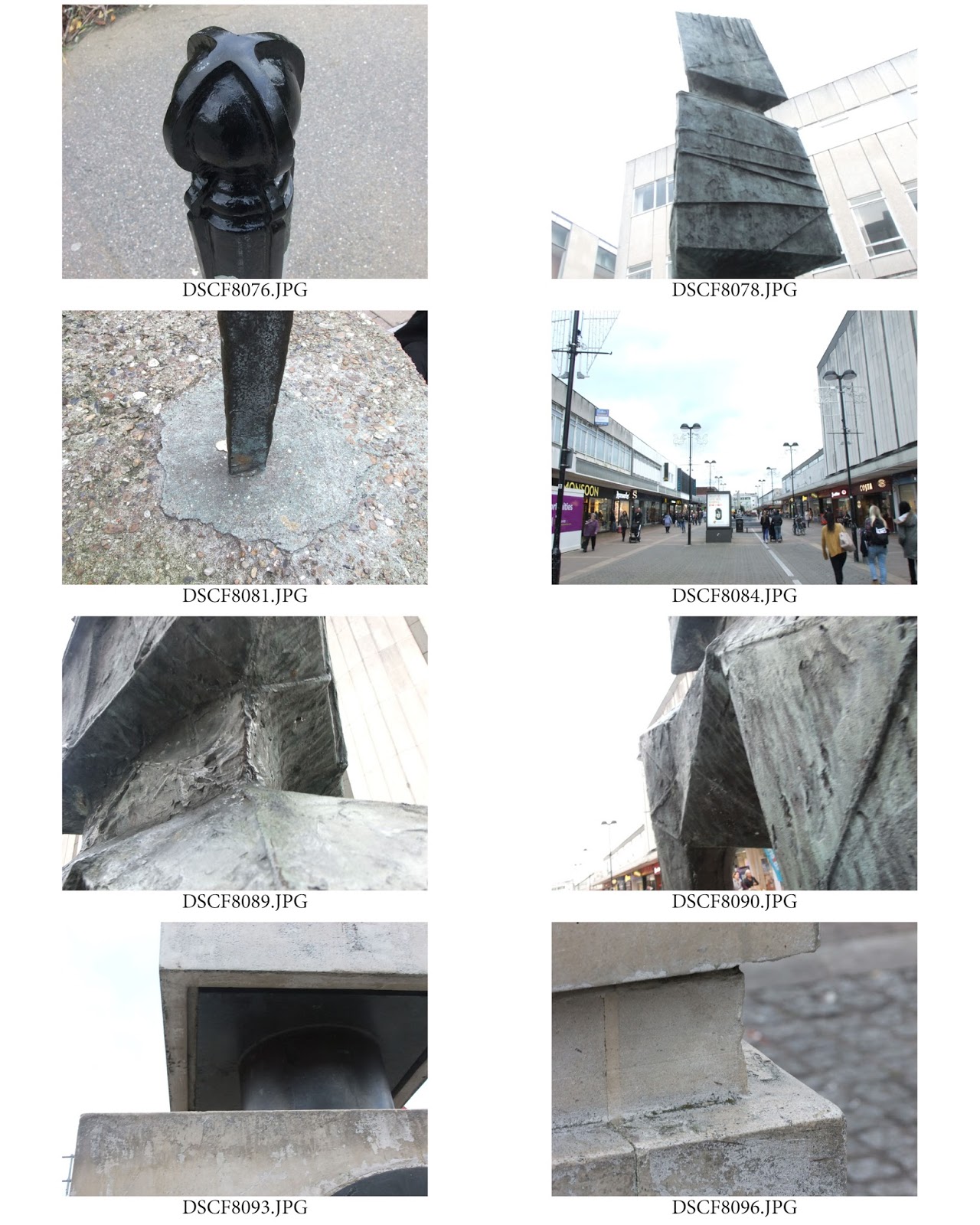
We also took photographs of sculptures to present the topic of depth. 

Depth Contact Sheet

Depth Contact Sheet