Thursday, 8 October 2015

Tone Work Diary

Tone - Work Diary

Evaluation

In the sessions this week, we were given the task of photographing for the topic of tone. At first, I found it difficult to find things to photograph. However, after a while, I was finding it much easier and found a wide range of things to take photos of. I especially enjoyed the session shooting in the studio as it allowed me to manipulate the lighting in order to capture images which presented tone well and included highlighted areas. I later found when I came to looking at the images that I had captured, that they worked much better in presenting tone when they were put into black and white form as they allow the viewer to focus more on the formal element of tone rather than focusing on the colour of the image.

This was my favourite image from the first shoot as I really like the detail and the various shades within the image. I edited the image in Photoshop and changed the colour to black and white. I think the image looks more effective like this as it focuses the viewers eye onto the element of tone rather than colour which was an issue with the original image (which is included in the straight images).


I do not like this image as I do not feel it represents the brief of tone very well. In somewaysit does show tone due to the different shades of grey in the barrier. However, I do not think the image grabs the viewers attention as it is quite boring and simplistic. I also do not like the composition of the image as the barrier is at too much of an angle and this makes the image less appealing.

I took this image in the studio during Thursday's session. I really like the outcomes of this shoot and especially like the above image. Again, I have edited this image on photoshop and have made it black and and white in order to focus the viewer on the element of tone  rather than colour. I think the edited image works much better in presenting tone than the original (which is in the straight images for the studio shoot) as it shows the different shades better in the image.

After taking the above shot of the mask, I decided to develop my idea more by getting someone to wear the mask and photographing that. I really like the outcome as I feel it follows on from my initial image well and tells a sort of story. I especially like the new edited version of the image (above) as I feel it allows the viewer to focus more on the element of tone in the image and not look at the colours. When I edited the image, I also increased the contrast in order to make the mask stand out more and become more eye catching as I wanted this as the main focus point in the image. 

Idea Development

If I had the opportunity to shoot for tone again, I would try to spend more time in the studio where I could manipulate the lighting and achieve the style of image that I wanted. From the images I captured during the studio shoot, I especially like my final two images with the mask, so I would try to develop this idea further if I were to shoot again. I would also experiment with more images in Photoshop, where I would make them black and white and assess whether this made them present tone more clearly. I would also experiment using colour filters as I think this may also give an effective and interesting look to the photographs. In addition, as well as shooting in the studio, I would try to get some shots which included natural forms of tone, such as wildlife, as I think this would make for very effective and eye catching images. Below are some images which I would use for inspiration if I were to go out to shoot for tone again.


Tone (studio shoot) - Straight Images - Best 5

Tone (studio shoot) - Straight Images

I took this image in the studio and used lighting to create tone in the image. I really like the image as I feel it gives an edgy feel. I also like how the light is coming from behind the doll as this way, it shows the darker side of the object and also gives a slight glow around the object which therefore focuses the eye to the main focus point of the image which is the doll. 

I used this object to explore tone further. I really like how in this image you are able to see the different shades and also can see the highlighted part on the object. Again, I took this during the studio shoot. I also edited this image to black and white which, in my opinion, made it look much more effective as it made the element of tone much more obvious.

I also made the image black and white. I think that this helped to show tone within the blacks and whites. I like the outcome and feel as though it is much more effective at portraying the formal element.

During the shoot, I developed the doll theme further by experimenting with another object. I like the way the hat shades the face as it creates another aspect of tone in the photograph. I especially also like how the hat blends into the background due to the manipulated lighting which I had set up in the studio. I also really like the shadows and shades which are in the doll's clothing.

I developed the theme of the mask by getting someone to wear it. I really like how this image has turned out and like how the light falls on the mask. I like how the mask is the most illuminated part of the image. This makes the mask the main focus point in the image and attracts the eye to the object in the image. I have edited the image to make it black and white (in the work diary). I think this looks more effective as it focuses the eye more on the aspect of tone rather than the colours which are in the original image.

I like this image as you are able to see the highlighted areas and the dark areas. I have edited this image in photoshop and given it a red tint which looks much more effective than the original as it allows the viewer to focus more on the element of tone in the image.

Tone (studio shoot) - Contact Sheet

Tone (studio shoot) - Contact Sheet


Tuesday, 6 October 2015

Tone - Straight Images - Best 5

Tone - Straight Images

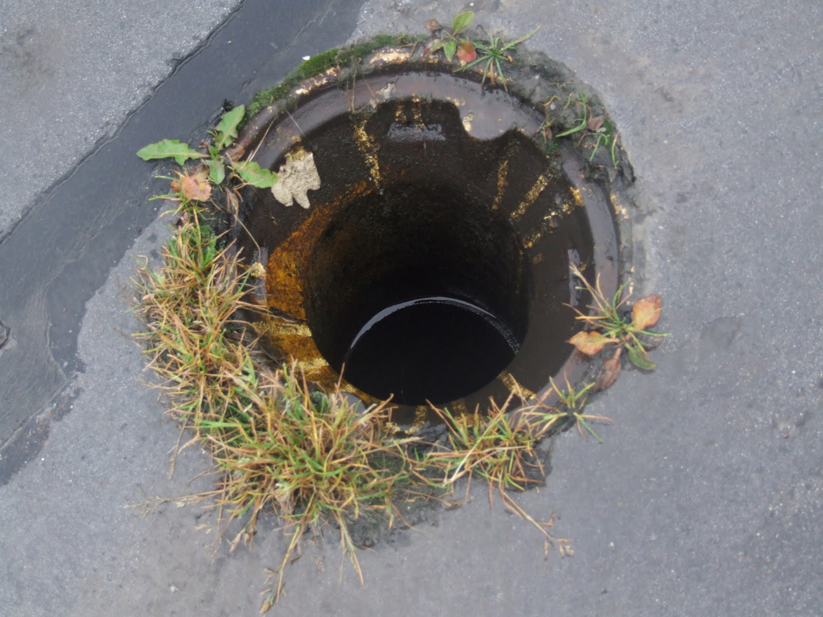
I really like this image as I think it shows depth due to the hole which is in the centre of the image. However, I think it would look more effective in black and white so the formal element of tone was more obvious in the image.

I then edited the image in photoshop and found that it looked better in black and white. I think the image looks more eye-catching in black and white and also presents the formal element of tome better.

This is one of my favourite images as I think it shows tone very well. I have this image in my work diary and have edited it to black and white. I think it looks better in black and white as it allows the shades to contrast more and therefore makes the image more appealing and striking.

I really like this image as it shows tone very well without any editing. I think the image is interesting due to the shape that is shown in the shoe print and also with the pattern in the shoe. I also like the image as you are able to see the detail in the tarmac and this makes the image more interesting.

I really like this image as it shows tone well without the image having to be edited. I also like how it is the water droplets which lead to the change in tones in the photo. This makes the image appear more detailed and interesting.

I took this image in the studio and had one side of the object lit and had the other side in shadow. I really like how my image turned out and like how the object is illuminated and the background is very dark. This makes the flowers the focus point of the image and makes the image eye-catching. I also photographed a doll in the studio. The images for this are included on my contact sheet.

Tone Contact Sheet

Tone Contact Sheet


Tone Image Bank

Tone Image Bank

I really like this image as it shows the light reflecting on the objects so therefore presents tone well. I also really like the range of shades which are in the image. This image looks especially effective due to the fact that it is in black and white as it focuses the viewer on the formal element of tone.

I really like this image as it is very interesting and looks very effective in black and white. It also presents tone well as you can clearly see that the fox is the main focus point in the image. It also looks effective as it looks as if the photograph is taken at night due to the shades of black and white in the image.

I really like this image as it shows a more man made example of where tone is used. I really like the contrast of the bright white and darker shades as it creates interest in the image. I also like how the image is somewhat symmetrical as it makes the image more appealing and eye catching.

This image was taken by Ansel Adams who is a photographer who focuses on tone in natural landscapes. I really like this image as the use of light makes the image look dramatic and therefore eye-catching. I really like though how there is a highlighted area in the image as it creates a focus point for the image and therefore makes it an attractive photograph. 

I feel that this image portrays tone very well but in an interesting form. The tones in the image are shown within the faces. The tones are made more obvious by the black and white filter and the very dark background. This image has inspired me to attempt some portrait like shots during my shoots for tone as I feel this image shows tone very well.

This image appears to be taken in the same style as the image above which is taken by Ansel Adams. I really like this image because it is dramatic and eye-catching. I also like how the clouds and sky are tonal as it gives the image an interesting feel.

Define - Tone

Tone Definitions

Tone - Tone refers to the overall lightness or darkness of an image. This could be a shade or how dark or light a colour appears.

Gamut - Range in relation to tone. 

Tone is often used to emphasise form in an image and tone is created by the way the light falls on a 3D object.


Four Annotated Images

This image presents tone very well due to the darker and highlighted areas which are present in the image. The lions mane shows tone the best due to very dark areas towards the edges of the image and the more highlighted areas that are present more towards the centre.

This image presents tone well due to its black and white filter. There are a wide range of tones which are present in the hands which makes the image quite interesting. Also, the way that the hands stand out against the dark background makes the image very effective.

This image shows an extremely simplistic interpretation of tone due to the fact that only two tones are present in the image. However this simplistic interpretation is quite effective and eye-catching due to the way that the stones are arranged.

This image presents tone in a very complex form due to the many different tones which are present in the photo. The image is very effective due to the black and white filter. This allows the tones to be more prominent and obvious.