Thursday, 15 October 2015

Shape (studio shoot) - Straight Images - Best 5

Shape (studio shoot) - Straight Images


I really like this image I took in the studio. I like how the object is transparent and therefore the light goes though and creates a lighter shadow which looks very effective. I also like how the background is black as it makes the glass more eye catching. I really like the new edited image, however, I also think this looks effective due to the transparent colours in the glass. This makes the shape of the glass more defined. I think that overall, the original image is the best in presenting shape. 

I then edited this image in photoshop and I really like the outcome. I like how you can see the highlight on the glass as this adds effect to the image. I think it also contributes to the element of shape as you are able to see the shapes that are on the glass. 

I like the idea in this original image as I think it shows the shape of the dream-catcher well due to the black background. However, in this original version, I feel the colours are too dull in comparison to the background and therefore the shapes do not stand out very well and it is not eye catching.

I then edited my image to black and white and increased the contrast. This edit on photoshop made the shape of the dream catcher stand out more and be more eye-catching which therefore draws in the viewers eye as being the main focus point in the image.


I really like this image as it is original and also appealing. I really like the different shapes which are created in the image, for example, the heart shape which is created by the folded pages in the centre. I feel the image looks creative and therefore catches the viewers eye.


I then edited this image in photoshop by making it black and white and increasing the contrast. I think that by the new colouring of the image, it makes the shapes stand out more and also makes the shape created by the folded pages more prominent. For this reason, I think the edited version of the image is the most effective.

I really like the composition of this image as I like the way the main object is in the centre of the frame but it is still interesting due to the chain at the bottom and the shadow which is on the left side of the frame. I also like the shapes which are shown in the image. I especially like the varied shapes which are present in the watch cover as well as the circular shape which is the watch itself.

I then edited the image by making it black and white. I really like the edited image as it makes the viewer focus more on the shapes rather than the colours that are in the image. I also like how the shadows are darker in this version which helps to draw the eye to the interesting and intricate shapes which are created in the shadows. 

I like this image as I feel it follows on well from my other photograph of the dream catcher. I really like how the different shapes within the dream catcher are able to be seen as many different shapes are shown. However, in this original version, I do not think that the colouring is effective.

I really like the edited version of this image. I increased the contrast and changed it to black and white. I think that this makes the image look much more effective as it focuses the viewers eye onto the shapes which are present in the image, rather than being distracted with the other formal element of colour.

Shape (studio shoot) - Contact Sheet

Shape (studio shoot) - Contact Sheet


Tuesday, 13 October 2015

Shape - Straight Images - Best 5

Shape - Straight Images

I likre this image as it shows a very interesting shape. I also like how the red in the leaf stands out against the green background as this therefore makes the shape in the leaf more apparent and prominent and will therefore draw the viewers eye to the main focus point in the image which is the leaf.

This image was inspired by the image in my image bank by Kim Hopf. When I was shooting, I attempted to make the image seem more pyramid shaped by shooting from a corner and looking up. I think the image has turned out very effective and I really love the shapes that have been created.

I experimented with my image on photoshop and made it black and white. I really like this version of the image and think that the removal of the colour adds a dramatic feel to the image, especially due to the clouds above the building which look more bold with the black and white filter. I much prefer this version of the image as it allows the viewer to focus more on the element of shape rather than the colours. I also think that the simple black and white filter allows the image to portray more feeling and be more bold and eye catching.

I really like this image and was very lucky to get this shot. I was photographing the little white flowers, as I think that they present shape very well, when the bee landed on them. I think the bee also helps to portray shape due to the elaborate shape and pattern on the wing which you can just see in the image. I also think that it has added interest to the flowers and therefore allows the viewers eye to focus on the little flowers more which present very intricate little shapes. I have not edited this image at all as I feel it looks very effective in its original colours and the white of the flowers allows the viewers eye to be drawn into them as the main focus of the image.

I really like this image due to the spherical shape against the sky. I think that the coloured background adds interest to the photo and allows the eye to recognise the top of the lamp as the main focus point of the image. However, I feel that the original version of this image (above) appears quite basic and lacks creativity and imagination.

I have edited the image on photoshop and have changed the colour of the sky to give the photo a slightly surreal and fantasy feel to it. The simple altering of the colour of the sky has, in my opinion, completely changed the image, and has made it much more eye catching and therefore draws the viewers eye more to the main element of shape which is presented in the image.

With this image, I was inspired by one of the images in my image bank. Although this is a less detailed version, I feel that overall the same theme has been captured. Like the photo in my image bank, I like the way that different shapes can be seen from the image as this creates interest to the image. If I were to photograph this again, I would try to get the shape more symmetrical in the frame as I think this would make the presented shapes more prominent and eye catching to the viewer.

Shape - Contact Sheet

Shape - Contact Sheet


Shape - Image Bank

Shape - Image Bank

I really like this image as it is taken from an original viewing angle which therefore makes the image more interesting. I also think that the colouring of the image contributes to the eye catching representation of shape as it draws the viewers eye to the image. I also like how the negative space is the frog's silhouette as it draws the viewers eye to the main focus point in the image.

I really like this image as I think the shapes of the flowers are very interesting and catch the viewers eye. I also really like how the colours of the flowers are very bright and bold. This therefore draws your eye to the main shapes which are presented in the image. I also like how the background is blurred as again, this makes the shapes stand out more.

I like how the main shape in this image is created by irregular shapes with the hands. I also like how the shape is against the bright blue background as this makes the image more bold and striking. In someways, the shape presented could be thought of as both irregular and geometric due to the fact that the shape that has been made by the irregular shapes of the human hands but is also presenting a rather geometric star shape. 

I really like this image as I think it presents a geometric and man made example of shape. I also really like how this image is in black and white as it allows the viewer to focus more on the element of shape rather than being distracted with the other formal element of colour. I also really like how there are lots of different shapes presented in the image, for example, triangles and diamond shapes, as well as many more.

I really like this image which was photographed by Kim Hopf.  I think the angle from which it is photographed adds an element of interest to the image which therefore causes the viewers eye to be drawn into the image. I also like the vibrancy of colours in the image as I feel this makes the red building, which appears more pyramid shaped in the image, very eye catching and striking. However, I also feel that this image would look effective in black and white as it would allow the viewer to see more detail and also would make the lines sharper and therefore it is possible it would make the image more effective and bold.

I really like this image and feel it shows shape very well but in an original form. The shape is very clear and looks very effective due to the fact that it is in the centre of the frame. This image has inspired me and I will try to capture a similar type of shot when I shoot for the topic of shape.

Shape - Bill Brandt Research

Shape - Bill Brandt Research

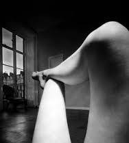
Bill Brandt is a photographer who looks at shape and focuses on the female form. In some of his images, he presents the use of negative space in order to make his images look more effective.

In this image, Bill Brandt uses negative space to focus the viewer to the main subject of the image which is the woman's face and arm. By using the negative space, he also makes the image look effective as it gives a strange perspective to the face as you are only able to see half of it. It also frames and defines the subject of the image and makes it stand out more.


Bill Brandt also photographs the irregular shapes which are present in the human form. Brandt mainly focuses on the human form and his work can be either viewed as art or the sexual objectification of women. 

Some react to the above image as being sexual objectification of women whereas others believe it is art. By photographing this type of image, the photographer will manipulate emotions and views in different audiences and therefore I believe that the above image could be considered as being both of these due to the fact that different people will react and respond to the image differently. Some people may find the image very inappropriate and may find it offensive, however, other people may be more open-minded and may be fascinated by the shapes and shadows in the image. However, in the case of this image, I believe that it could be regarded as slightly sexualised due to the fact that the photograph only includes the woman's legs and doesn't show her face. This could suggest that the photographer is trying to remove the woman's identity in order to sexualise her. However, as a photography student, I think that the intention of this photograph was to be regarded as a form of art.

Define - Shape

Shape Definitions

Shape - An area enclosed by a line. It can be shaded or may just be an outline. Shapes can be geometric or irregular.

Negative Space - Refers to the empty space around the subject or focus on the image. In the image below, the black area in the shape of the frog is the negative space.

Four Annotated Images

This image shows shape well due to the uniform heart shapes which are in the leaves. The shapes stands out well due to the bright colours of the leaves against the darker background. The image is also successful in presenting shape due to the added shape of a circle which are present in the form of the water droplets.

This image is very eye catching and striking. It uses negative space to create a heart shape from the elephant's trunks. This is made to stand out more due to the backdrop of the bright sunset. Although this photograph is extremely eye-catching and appealing, it would be extremely difficult to recreate!

This image uses the pencils to create a circle shape. In this image, I like how the colours of the pencils assist in the formation of the circle on the white background. The colours of the pencils also help to make the image more interesting and attractive.

This image is effective due to the intricately engraved shape in the fruit. This image is also appealing due to the composition of the shot as the fact that the fruit is positioned to one side of the frame makes the image more interesting and eye-catching.