Friday 12 February 2016

Physical Image Experiments - Straight Images

Physical Images


This image was inspired by Dyren Goodwin who physically manipulates images. especially portraits, and scratches into them. For this image which I did, I used scissors to scratch into the photo. I slightly altered from the artist style and mainly scratched into the background rather than the face. I overall like this image and feel it looks effective in black and white.


This image was also inspired by Dyren Goodwin. I like this image as the shadowed side of the face is scratched in by hand which makes the image look very effective and interesting. You could think by looking at this image that the figure is trying to hide their identity due to the majority of the face being in shadow and also the facial features having been scratched in.


For this image, I screwed up the image and then opened it back out. I like the way that by doing this, some of the black ink had come off the photograph and also like how this makes the image look old and worn. I like the way that this effect makes the image have a sort of polaroid effect as this makes it look interesting. I also like the fact that you are able to see some texture in the image.


For this image, I burnt out the reflection of the person. I liked the idea of this as it could be thought to link to the idea of lacking or forgotten identity. I think this image could be thought to relate to the 'Chinese Photobook' as this also saw people being cut out of images which could therefore relate to the image above.


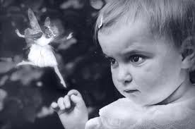
I manipulated this image by painting into the image. I painted a ghostly figure into the image in black and white. I think that this looks effective as the painted figure is slightly hidden due to the whole image being in black and white. I think that this image looks very effective and I am pleased with the outcome.


This physical manipulation was quite simple to do and shows colourful paint splatters. I like the contrast between the colourful splatters against the bold black and white image. Although this edit has no hidden meaning, I think that it looks very effective and interesting.


I then edited this image, again by painting onto it. I used the paint to make the horse in the image appear similar to a Red Indian horse. This idea was inspired by an artist called Marcia Baldwin who paints horses in this style. Overall, I really like the image and think it is very interesting and also quite striking to the audience.

Thursday 11 February 2016

Physical Images - Artist Research

Physical Images - Artist Research

Dryden Goodwin

Dyren Goodwin is a British artist who is known for his intricate drawings which he often uses in combination with photography, film, screen based installations and soundtracks. He was born in 1971 in Bournemouth and was educated at the Slade School of Fine Art. In many of his photography works, he uses a scalpel to engrave into the photographs to create a look which appears as scars on the people which the engravements are on in the photos.

I like this image due to the added effect in the image which appears to look like water droplets. I like how the engravements in this image is in red as this looks as though there are scratches on the man's face. I like the composition of the image and like the intricate patterns which are present in the engravements. 


I like how the image is in black and white and like the more spaced out engravements in this image as it helps to make the physical edits look more obvious. I like how the edits can be used to portray the scars of the individuals which are present in the image.


I like this image as I feel it is effective how half the image is in shadow. Looking at these images makes me think it might be a nice ideas to adopt the engravement technique myself but do it on the negative space which is either side of the portrait. This may help to make the portrait face stand out more.


I like this image due to to the fact that it has lots of intricate details to it. I like how it appears to be more white due to more of the engravements. I like how this image is taken at an alternative angle to the others as this makes it look different and effective. I like how the individual in the image appears to be deep in thought as this therefore makes the image more thought provoking for the audience.

Thursday 4 February 2016

Fourth Plinth - Work Diary

Fourth Plinth - Work Diary

Evaluation

Overall, I think that my fourth plinth project went well and feel that I managed to create some interesting and original images. In total, I created seven composite images using different landscapes and using the same object which was a small plush fairy. I thought the idea was good for the fourth plinth project as fairies are obviously related to fantasy and are therefore not something that you see everyday which therefore make it ideal for the project. I positioned the fairy in a variety of landscapes. One set of the images were with it placed in countryside landscapes while the other set had it positioned in a city landscape. Below shows my favourite and least favourite image out of the seven which I produced.


This is my favourite image from the ones which I created as the surreal element is not completely obvious at first glance and therefore requires the audience to look at the image more closely in order to find the hidden aspects. I like the way that in the image the fairy appears to be perching up in the tree. This could make the viewer perceive the fairy as being mischievous which adds interest to the image.


This is my least favourite image out of the seven which I created. Obviously, I edited the image using photoshop but I feel that the editing is more obvious in this image than the others and feel it is not as well done. I do not feel that the burning to create a shadowed effect in this image is overly effective as the day on which the image was show was not sunny. Also I feel that because the background image was shot at an angle, the fairy needed to be at an angle as well which is not. I think that this would make the image look more realistic and natural and therefore more effective.

Idea Development

If I were to look at the topic of the fourth plinth again, I would try to perhaps work with a larger object as I feel this would make it easier to photograph in the studio and add to the images. However, if I were to complete the topic again involving the fairies, I would perhaps use photoshop to manipulate the colours of their clothing and maybe use multiple fairies to create a more permanent and colourful feel to the images. I think this would help to make the composite images more attractive and striking to the audience and would also make them more eye-catching. Also, before I started the topic, I would perhaps look at the Cottingley fairy images for inspiration and perhaps attempt to recreate similar images but with a modern twist. Below are some of the images which I would use as inspiration for this.


Fourth Plinth - Fairy in London

Fourth Plinth - Fairy in London

After adding the plush fairy to countryside landscapes, I decided to use some of the photographs that I took in London and add it to that setting. I feel that this allowed me to create some more interesting images which surrounded the fairy as the surreal element for the fourth plinth project. 
Below shows how I created one of my composite images using photoshop.

First, I took my original image and adapted the curves in order to make it brighter. I then selected my image of the fairy, used the quick select tool to select it and then finally copied and pasted it onto my original image. 

Once the fairy was moved onto the image. I selected edit and transform in order to rescale and move the fairy image.

Once the image was positioned in my desired place and was scaled in a way that I was happy with, I used the burn tool to create a shadow on the fairy and statue in order to make it look more realistic. To finish, I adapted the curves of the fairy layer to make it bolder.


I created this image using photoshop and like the way that the angle of the added image compliments the angle of the original image. I also like how the fairy is bold as this makes it more obvious and therefore attracts the viewers eye more. I tried to make the image appear as though the fairy was sitting and looking out and watching the fountains. I feel the image is effective as it is very surreal and therefore supports the topic of the fourth plinth. 

I like this image as when you first look at it, you are unable to notice the surreal object within the image. I like how the fantasy element is not obvious as this therefore makes it seem more mysterious when the viewer finally notices the fairy which is hidden to the side. I like the way that the fairy appears to be sitting on the traffic light button and also appears to be watching the traffic. I think this image also supports the fourth plinth element as the object is somewhere strange and where you would not usually see it. 

I created another image of the fairy sitting on a pillar. I like this image as it looks as though the fairy is watching the pedestrians walk past. I like the way that the original image would be boring by itself but with the added element of the fairy, the image becomes interesting and attractive to the audience to look at.